Skip to content

refine highlight's spacing and border-radius #1165

New issue

Have a question about this project? Sign up for a free GitHub account to open an issue and contact its maintainers and the community.

By clicking “Sign up for GitHub”, you agree to our terms of service and privacy statement. We’ll occasionally send you account related emails.

Already on GitHub? Sign in to your account

Merged
merged 2 commits into from
Jul 9, 2020

Conversation

XAMPPRocky
Copy link
Member

@XAMPPRocky XAMPPRocky commented Jul 1, 2020

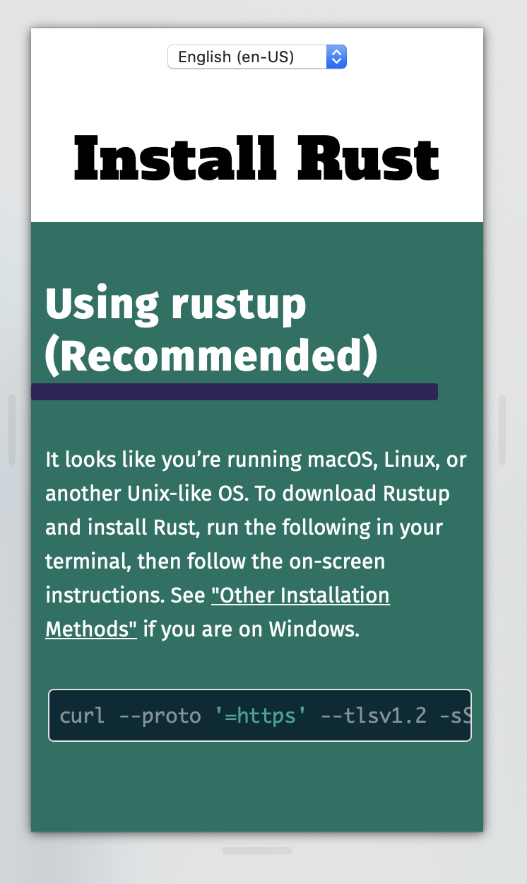
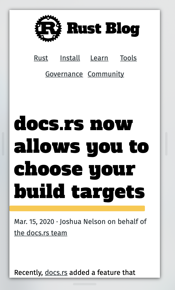
Updates highlight spacing so it doesn't clash with the descent in some titles and updated the border radius to be visually consistent with the buttons.

Production

Screenshot 2020-07-01 at 10 19 06

Staging

Screenshot 2020-07-01 at 10 18 50

Proposed Changes

Screenshot 2020-07-01 at 10 25 56

@Manishearth
Copy link
Member

The clashing of the highlight spacing was a deliberate design choice, fwiw. @ashleygwilliams do you have any thoughts on changing this?

r=me on the border change

@XAMPPRocky
Copy link
Member Author

XAMPPRocky commented Jul 4, 2020

I'm aware it's a deliberate choice. The motivation for this change is that the "highlight" works best on one line titles however the clash doesn't work in my opinion with multi-line titles and makes them harder to scan, as it doesn't feel like it part of the title in the same way when it's a single line. This stands out particularly in the blog, I've pasted some screenshots of examples.

Screenshot 2020-07-04 at 17 22 01

Screenshot 2020-07-04 at 17 23 08

Screenshot 2020-07-04 at 17 17 57

Screenshot 2020-07-04 at 17 19 04

Screenshot 2020-07-04 at 17 19 48

Screenshot 2020-07-04 at 17 19 39

@Manishearth
Copy link
Member

(In the future, please include such motivation in the PR itself)

This seems fair, but it seems to largely be a concern for the mobile site where such wrapping is common. I wonder if we can media query it to only apply to the site on mobile? (in general I think the styles need some tweaks on mobile) I think it looks kinda nice on desktop, and I've seen a trend of websites using this kind of underline style elsewhere too.

I'd also still like to hear from Ashley.

@XAMPPRocky
Copy link
Member Author

(In the future, please include such motivation in the PR itself)

This is not the PR that makes that change. #1136 had been open for over a month with no concerns raised and I had talked to other team members who were also in favour of the change. In the future I would appreciate leaving concerns on the appropriate PR before it's merged, instead of in follow up PRs.

@Manishearth
Copy link
Member

@XAMPPRocky okay, I wasn't aware of that PR, it must have slipped my notice. Nor was I aware other team members supported it. I do think we should do team pings for major styling changes, though (this PR is fine).

r+ on this and the blog PRs, then.

@XAMPPRocky XAMPPRocky merged commit cdfafe6 into rust-lang:master Jul 9, 2020
Sign up for free to join this conversation on GitHub. Already have an account? Sign in to comment
Labels
None yet
Projects
None yet
Development

Successfully merging this pull request may close these issues.

2 participants