Migrate message context menu to IconizedContextMenu #5671
Conversation
 weeman1337
force-pushed
the
msg-context-menu
branch
from
weeman1337
force-pushed
the
msg-context-menu
branch
from
5e6793d to
c2b31d1
Compare
weeman1337
changed the title
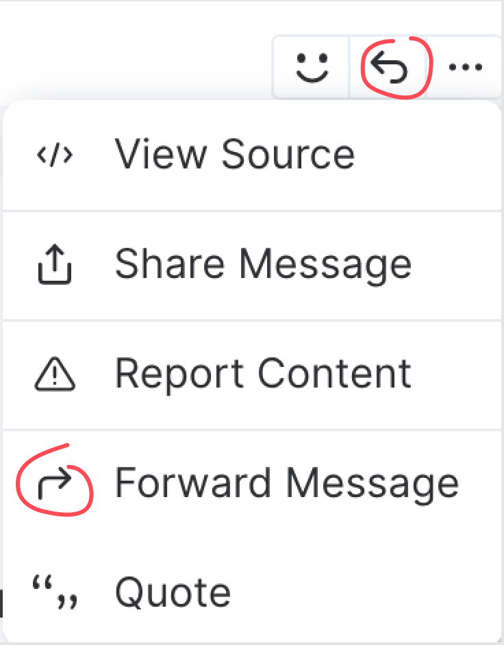
Design review@weeman1337 Thank you so much for this contribution. ### Ordering In the product today, the destructive options are at the bottom of other context menus. Remove should be at the end of the list. Please can the order be as follows:
This order is optimized for continuing discussion within Element - the first options being ones that enable further communication. Iconography
Just a few points. I went through the element icons to try to find appropriate ones. I personally prefer a few of the feather ones (e.g quote looks more familiar in your icons, share feels better), but consistency first and then changing the icon globally later. Please use these element icons:
Misc
There appears to be no bottom border on the penultimate item. It looks like maybe it's because two menuitems are within the same IconizedContextMenu_optionList causing this? I totally appreciate this is not necessarily part of your PR but it might help improve the menu a tiny bit. The menu text is a bit long-winded/inconsistent. For example, quote is just a Please feel free to mention me if there's any questions/when I can take another look. Will be sure to stay on top of this issue to get it through review asap. Thanks again for this change! |
|
@niquewoodhouse wouldn't it be a good idea that the "remove" option has its icon and text in red? |
weeman1337
force-pushed
the
msg-context-menu
branch
from
63f1e4a to
969e96b
Compare
|
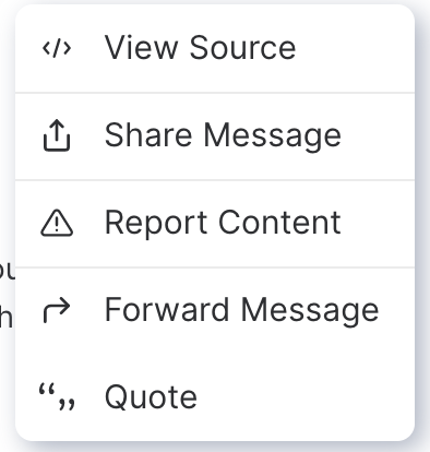
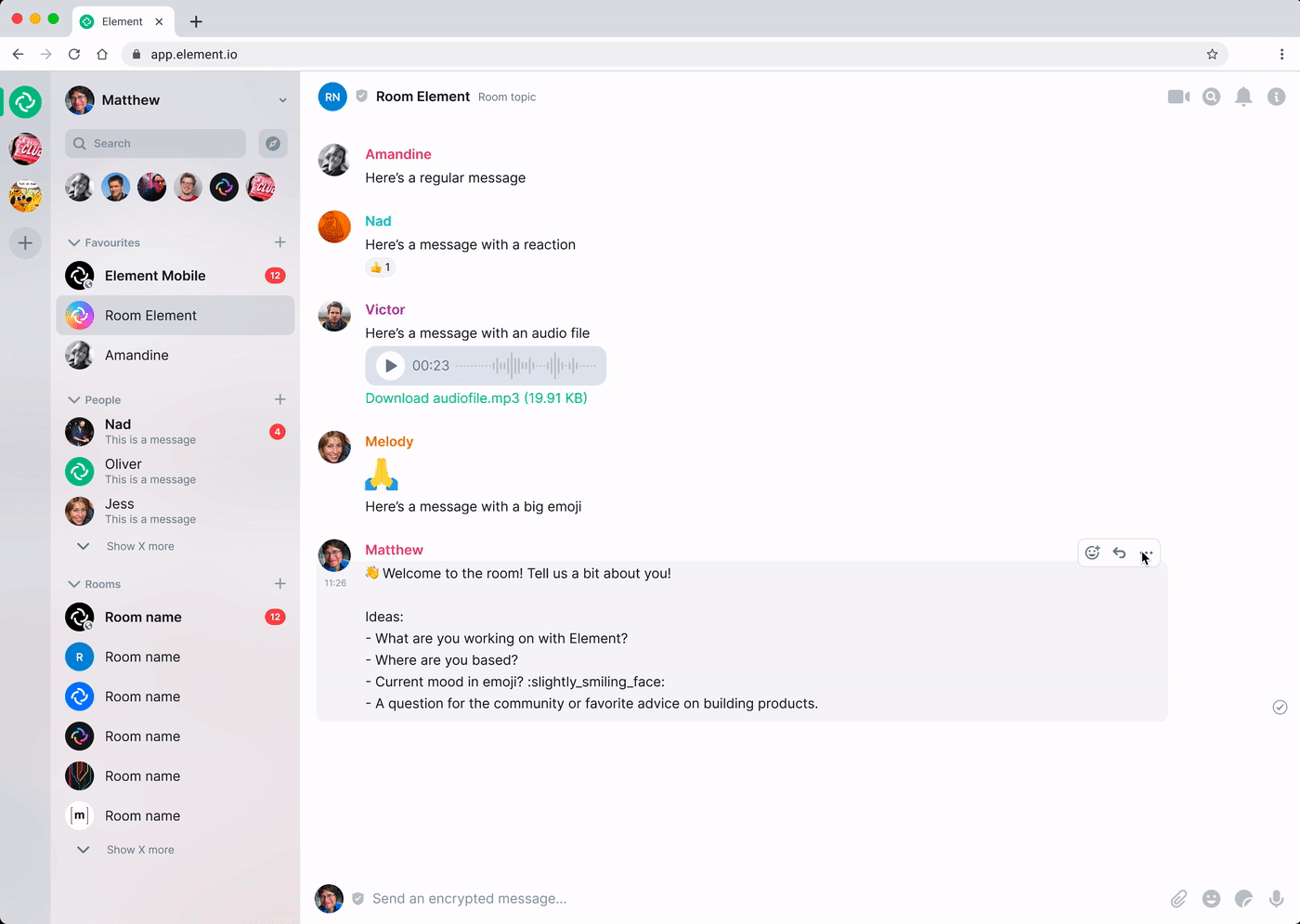
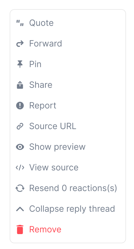
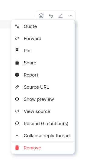
Thanks for the reply @niquewoodhouse Here is how it currently looks like:
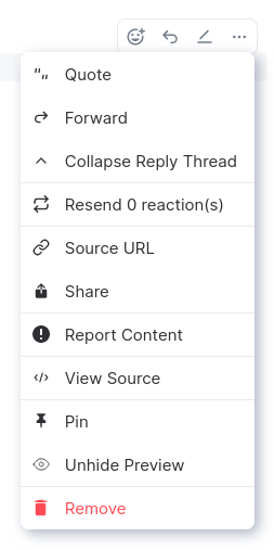
I have updated the icons and labels according to your suggestions. Regarding the order and grouping the context menus have two levels: Groups and items. Unfortunately the original screenshot in the PR description doesn't show all the items because some are bound to a condition. See my screenshot in this comment for all the items. I can reorder them as you like. The icons sizes of the context menu icons are currently 16px. Like for example in the "main menu":
(The |
|
@weeman1337 Thanks so much for the response with all the items that could be there, really helps to see what needs doing in a comprehensive view like that. I put them in a big list (please ignore any styling differences between this design and the existing context menu)
I guessed that Pin becomes Unpin, and that Unhide becomes its opposite Hide, just included them as different ones for reference. Icons
Ah, that sucks. I didn't make the icons and just expected them to be able to sit nicely together. The icons are actually a bit painful generally at the moment now I look at them a bit more. Attached is a new We're definitely keen to redraw icons to be a) more understandable generally b) have a clear consistent relationship with eachother (eg even just being the same size would be great) but it's just going to push this change further back. So I'm guessing some icons might still look a bit strange, but they should now look not too strange and we should fix them all separately. Order of options & groups and items I don't understand the logic of the groups and items. I'd like to amend their order to be like this longer-term:
But I'd suggest retaining whatever ordering it has for now. I imagine being used to, say, collapse thread being underneath forward, and now I can't find it...it's annoying. There's already enough change happening. I'd just suggest removing the borders completely from the context menu, or just having 1 border above the remove option. I find all the borders make it slightly hard to compare the options because it makes you skip some/distract you from comparing icons/reading labels. Thanks for this contribution! |
 weeman1337
force-pushed
the
msg-context-menu
branch
2 times, most recently
from
weeman1337
force-pushed
the
msg-context-menu
branch
2 times, most recently
from
7a1344c to
901047d
Compare
|
@niquewoodhouse I have just had some time to implement your suggestions. Here is what it looks now (if all items are being displayed): The line above remove is more or less required because the colour is bound to the respective group (groups are separated by lines). |
 SimonBrandner
left a comment
SimonBrandner
left a comment
SimonBrandner
left a comment
There was a problem hiding this comment.
Mostly LGTM code-wise, just some styling
| if (redactButton) { | ||
| optionLists.push(( | ||
| <IconizedContextMenuOptionList key={'group2'} red> | ||
| {redactButton} |
There was a problem hiding this comment.
| {redactButton} | |
| { redactButton } |
weeman1337
force-pushed
the
msg-context-menu
branch
from
901047d to
d5bfc51
Compare
Even if it's possible to remove this, id say to keep it in, it makes the separation of all other "progressive" actions vs this "destructive" action even stronger. |
SimonBrandner
left a comment
SimonBrandner
left a comment
There was a problem hiding this comment.
Regarding the styling. There already is a rule set up in https://github.com/matrix-org/eslint-plugin-matrix-org to which Element is slowly migrating. The js-sdk already uses it but the react-sdk doesn't, yet.
 niquewoodhouse
left a comment
niquewoodhouse
left a comment
niquewoodhouse
left a comment
There was a problem hiding this comment.
lgtm, thank you so much for your patience in going through a couple of rounds of feedback on this.
 t3chguy
left a comment
t3chguy
left a comment
t3chguy
left a comment
There was a problem hiding this comment.
LGTM other than one small code style nit
|
CI seems unhappy |
weeman1337
force-pushed
the
msg-context-menu
branch
from
40588ea to
8f7afc1
Compare
Signed-off-by: Michael Weimann <[email protected]>
Signed-off-by: Michael Weimann <[email protected]>
Signed-off-by: Michael Weimann <[email protected]>
Signed-off-by: Michael Weimann <[email protected]>
Signed-off-by: Michael Weimann <[email protected]>
Signed-off-by: Michael Weimann <[email protected]>
Signed-off-by: Michael Weimann <[email protected]>
Signed-off-by: Michael Weimann <[email protected]>
Signed-off-by: Michael Weimann <[email protected]>
weeman1337
force-pushed
the
msg-context-menu
branch
from
8f7afc1 to
b0a3285
Compare
I have rebased the branch - it is happy now 😄 |
|
Unfortunately, some of your commits are missing the sign-off, any chance you could add it to the PR description? Thanks |
Signed-off-by: Michael Weimann <[email protected]>
Signed-off-by: Michael Weimann <[email protected]>
weeman1337
force-pushed
the
msg-context-menu
branch
from
f3203c7 to
d3bc7fe
Compare
I have added it to the commits. |
5 participants
closes element-hq/element-web#16182
Open points:
IconizedContextMenuitems support grouping. For now I have just put them into an order that looks useful to me. I am completely open for suggestions.Looks quite good: