msglist: Pad left and right insets #3
Conversation
f543952 to
e693588
Compare
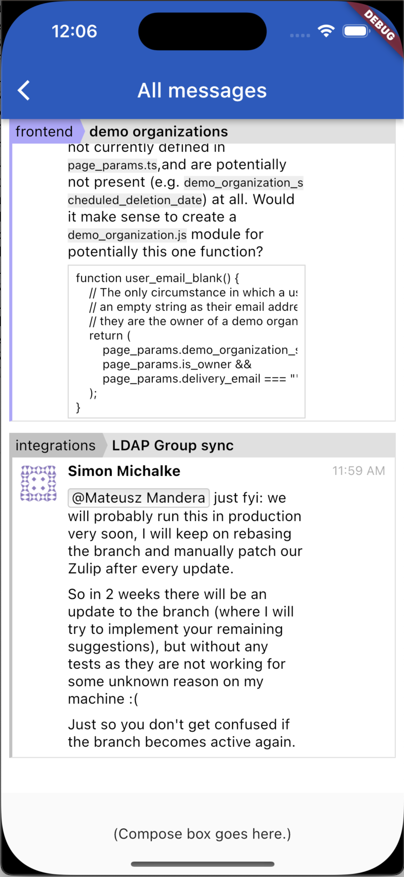
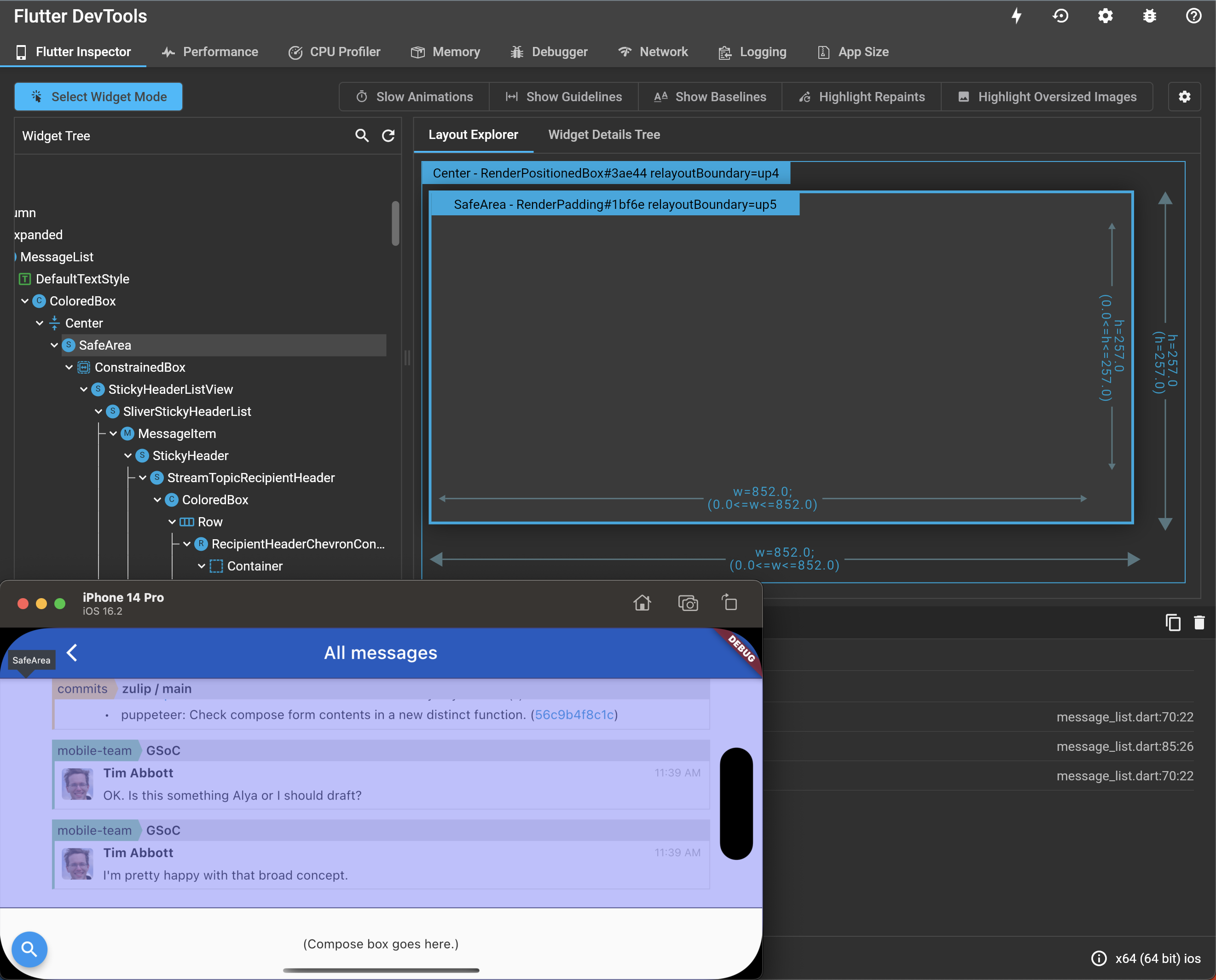
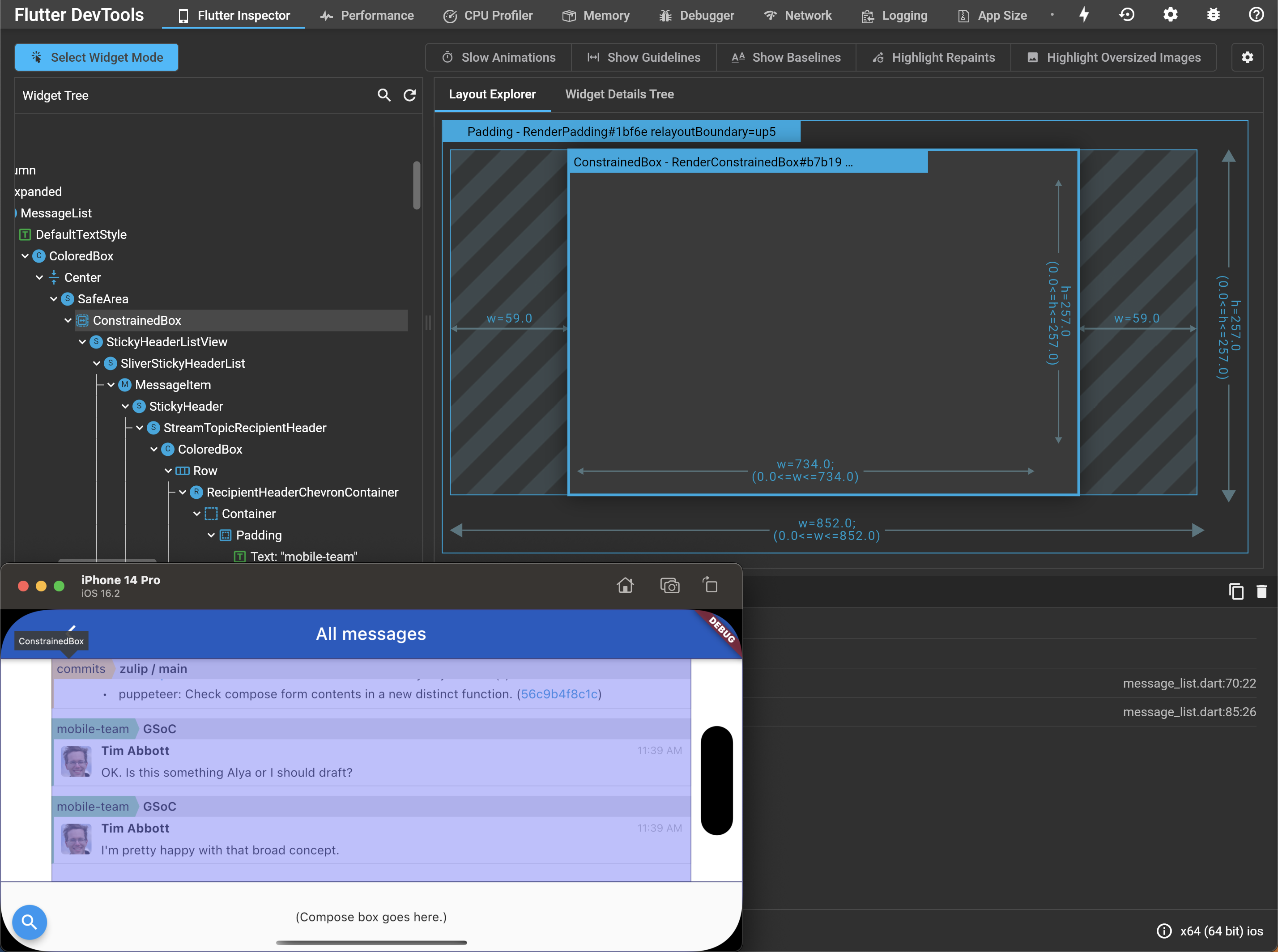
Before:
After:
|


There was a problem hiding this comment.
Thanks for taking care of this!
One comment below, and one other question:
- If there's an inset on one side, does this pad things symmetrically on both sides? In the screenshot it kind of looks like that's what it's doing. But surely
SafeAreadoesn't always do that; what causes that to be the behavior here?
lib/widgets/message_list.dart
Outdated
| // Keep some padding when there are no horizontal insets, | ||
| // which is usual in portrait mode. | ||
| minimum: const EdgeInsets.symmetric(horizontal: 8), |
There was a problem hiding this comment.
What's the reasoning for doing this rather than using a Padding in the child?
IIUC, the difference is that when there is an inset (of 8px or more), using minimum means we won't add padding beyond the inset. But in your screenshot it looks like there is padding there in the end:
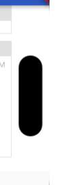
Is that coming from somewhere deeper in the tree?
There was a problem hiding this comment.
But in your screenshot it looks like there is padding there in the end
Do you mean the ~8px between the outline of a message in the message list, and that black oval hardware thing? That's part of the inset, as told to us by the platform, and the screenshot doesn't show any additional padding.
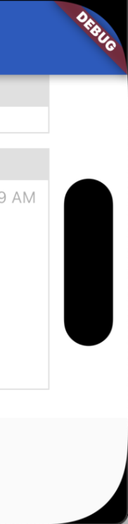
One thing that might help this make sense: that ~8px distance protects you from rendering content that might get clipped by the rounding of the screen's corners. Note that the "x" coordinate of the right edge of the message list is where the screen starts rounding its corners.
Or another: it looks like that same ~8px distance is used to offset the oval from the right edge of the screen, which has the nice effect of centering the oval in this area that apps are asked to treat specially.
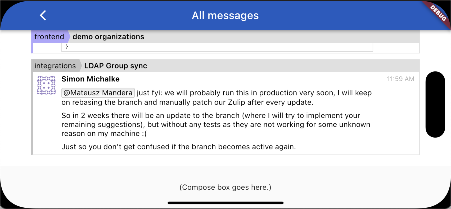
There was a problem hiding this comment.
Here are screenshots of the added SafeArea being highlighted, and then its child:
e693588 to
bfcc2bb
Compare
|
Thanks for the reviews (above, and in the office the other day)! Revision pushed. |
bfcc2bb to
9f30703
Compare
By adding a Center widget.

Leaving the 8px padding and the `maxWidth: 760` constraint on the
list-view child.
On some small devices in landscape mode, the `maxWidth: 760`
constraint doesn't (and isn't meant to) prevent the content from
extending into the left and right insets. So, use a SafeArea widget
for that.

In contrast to the SafeAreaView component from
react-native-safe-area-context in the RN app, this SafeArea widget:
  - knows when an ancestor has declared the given inset(s) consumed
    (by reading the ambient MediaQueryData.padding), and
  - declares the given inset(s) consumed (by changing its
    descendants' ambient MediaQueryData.padding).

It's left unaware of non-ancestors that consume insets. It turns out
that some insets are consumed by non-ancestors in this case; study
how that's done and add a few lines to adapt.

See the doc:
  https://api.flutter.dev/flutter/widgets/SafeArea-class.html

The `minimum: 8` should preserve the existing 8px padding in all the
places we want it, including:
  - phones with no notches/etc.
  - notched phones in portrait mode where the norm is to have no
    notches/etc. on the left or right.
lib/widgets/message_list.dart
Outdated
| child: SafeArea( | ||
| // A non-ancestor (the compose box) pads the bottom inset; | ||
| // prevent extra padding here. | ||
| bottom: false, | ||
|
|
||
| // A non-ancestor (the app bar) pads the top inset. But no | ||
| // need to prevent extra padding with `top: false`, because | ||
| // Scaffold, which knows about the app bar, sets `body`'s | ||
| // ambient `MediaQueryData.padding` to have `top: 0`: | ||
| // https://github.com/flutter/flutter/blob/3.7.0-1.2.pre/packages/flutter/lib/src/material/scaffold.dart#L2778 |
There was a problem hiding this comment.
Given how convenient it is that we don't need to worry about the app bar and disabling the top inset, I suspect the preferred Flutter style here would be for MessageListPage to do its children the same sort of courtesy that Scaffold is doing. Then we'd get to just say SafeArea(minimum: …, child: …) and have that do the right thing, with no worrying about what siblings or neighbors this widget might have.
Especially because in the future we might have message lists without a compose box, just as we do in the RN app.
No need to do that right now, but I'll add a TODO comment with this thought.
9f30703 to
88f3b73
Compare
|
Thanks! |
The user-visible effect was pretty small, so I didn't debug it fully
in PR zulip#3: on my iPhone, before this commit, scrolling all the way
down in the message list left about a centimeter, maybe less,
between the bottom of the latest message and the top of the
compose-box placeholder.

Now, on my iPhone, scrolling down puts the bottom edge of the latest
message flush with the top of the compose-box placeholder, as has
been the case on devices without insets. I'm not sure if that's
quite the effect we want, but if we want to add padding, we should
do it on purpose.

Addressing Greg's TODO in 88f3b73 would have prevented this bug
from sneaking in; I'll take care of that next:

  // TODO have MessageListPage adjust the MediaQuery so we don't
  //   have to worry about this here
And write up some findings about how safe-area handling works in Flutter.
Screenshots coming soon.