


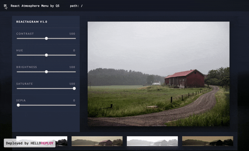
http://lightninglu10.reactatmosphere.hellodeploy.com/
Use NPM or Yarn
yarn add react-atmosphere-menunpm install --save react-atmosphere-menu1 . Require react-atmosphere-menu after installation
import AtmosphereMenu from 'react-atmosphere-menu'2 . Wrap react-atmosphere-menu around your app
<AtmosphereMenu>
  <YOUR APP />
</AtmosphereMenu
3 . Customize options
var nav = [
  {id: 'home', label: 'Home', path: '/'},
  {id: 'about', label: 'About', path: '/about'},
  {id: 'discover', label: 'Discover', path: '/discover'},
]
<AtmosphereMenu
  active={this.state.atmosphereActive}
  nav={nav}
  reactRouter={true}
  tagLine={"Made by"}
  companyName={"Q5"}
  closeMenu={() => this.setState({atmosphereActive: false})}>
  <YOUR APP />
</AtmosphereMenu| Option | Type | Description |
|---|---|---|
| active | Boolean | true will show the menu and false will hide the menu. (Required) |
| nav | Array | An array of objects that describe the navigation menu. Each object needs to have keys id, label, and path. (Required) |
| reactRouter | Boolean | true if you use React Router in your project false if you don't. |
| tagLine | String | Below the navigation, there will be an area for extra text. The tagline goes above the company text. |
| companyName | String | Below the navigation, there will be an area for extra text. Here you can display your name or company or group. |
| logoComponent | Component | Displayed in line with the companyName, add a component for a logo like so: <img src={LOGO} />. |
| closeMenu | Function | The function that closes your atmosphere menu. Should set the variable for the active prop to false. |
| backgroundImage | Image / String | An image you want to display in the background on the active Menu or a color. It can be a link to an image online, a file, or #eee. |
| Option | Type | Description |
|---|---|---|
| menuClassName | String | Extra class to style the AtmosphereMenu component. Default: menu: { position: 'relative', overflow: 'hidden', }, |
| appClassName | String | Extra class to style your app when the menu is active. |
| companyClassName | String | Extra class to style the companyName text. |
| navItemClassName | String | Extra class to style each Navigation item. Default: navItem: { marginBottom: '25px', opacity: '.7', ':hover': { opacity: '1',}}, |
| navLinkStyle | String | Extra prop to style the <a> or Link element of each Navigation Item. Default: linkStyle: { textDecoration: 'none', color: '#fff', fontWeight: '300', '@media only screen and (min-width: 768px)': { fontSize: '2em', }, '@media only screen and (min-width: 1440px)': { fontSize: '2.5em', }}, |
| linkClassName | String | Extra class to style the <a> or Link element of each Navigation item. Has the same style default as above navLinkStyle. |
| navClassName | String | Extra class to style the whole Nav component. |