Skip to content

Conversation

jonnysmillie
Copy link
Contributor

@jonnysmillie jonnysmillie commented Jul 20, 2022

  • Remove /main-docs/ from urls.
  • Remove navigation icons.
  • Restructure navigation.
  • Redirects for all /main-docs/ routes.
  • Link changes for internal links with/main-docs/ in the url.

@netlify
Copy link

netlify bot commented Jul 20, 2022

Deploy Preview for substrate-docs ready!

Name Link
🔨 Latest commit 51ea75a
🔍 Latest deploy log https://app.netlify.com/sites/substrate-docs/deploys/62fcade49796690008f95c57
😎 Deploy Preview https://deploy-preview-1266--substrate-docs.netlify.app
📱 Preview on mobile
Toggle QR Code...

QR Code

Use your smartphone camera to open QR code link.

To edit notification comments on pull requests, go to your Netlify site settings.

@jonnysmillie jonnysmillie added the ⛔ DO NOT MERGE ⛔ WIP! Changes needed. label Jul 20, 2022
@jonnysmillie jonnysmillie requested a review from rmnprkrl July 20, 2022 13:41
@rmnprkrl
Copy link
Collaborator

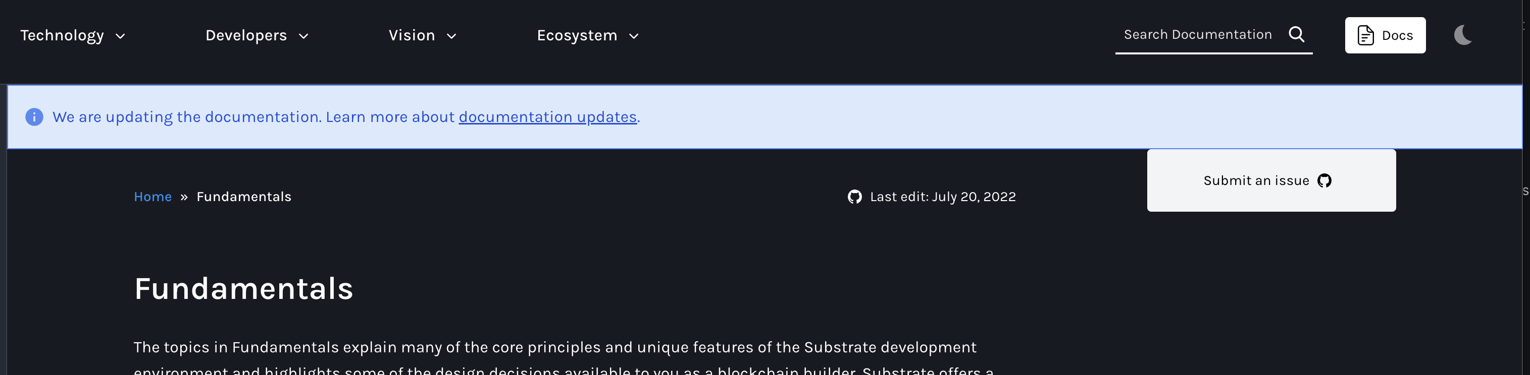
to me this looks great and the IA makes sense!

I would consider to improve the UI to add also the border to the footer, and overflow the nav items that way

image

@nuke-web3
Copy link
Contributor

supersedes #1108

@rmnprkrl
Copy link
Collaborator

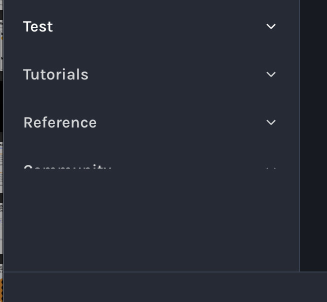
this situation needs to be handled

image

@rmnprkrl
Copy link
Collaborator

rmnprkrl commented Jul 29, 2022

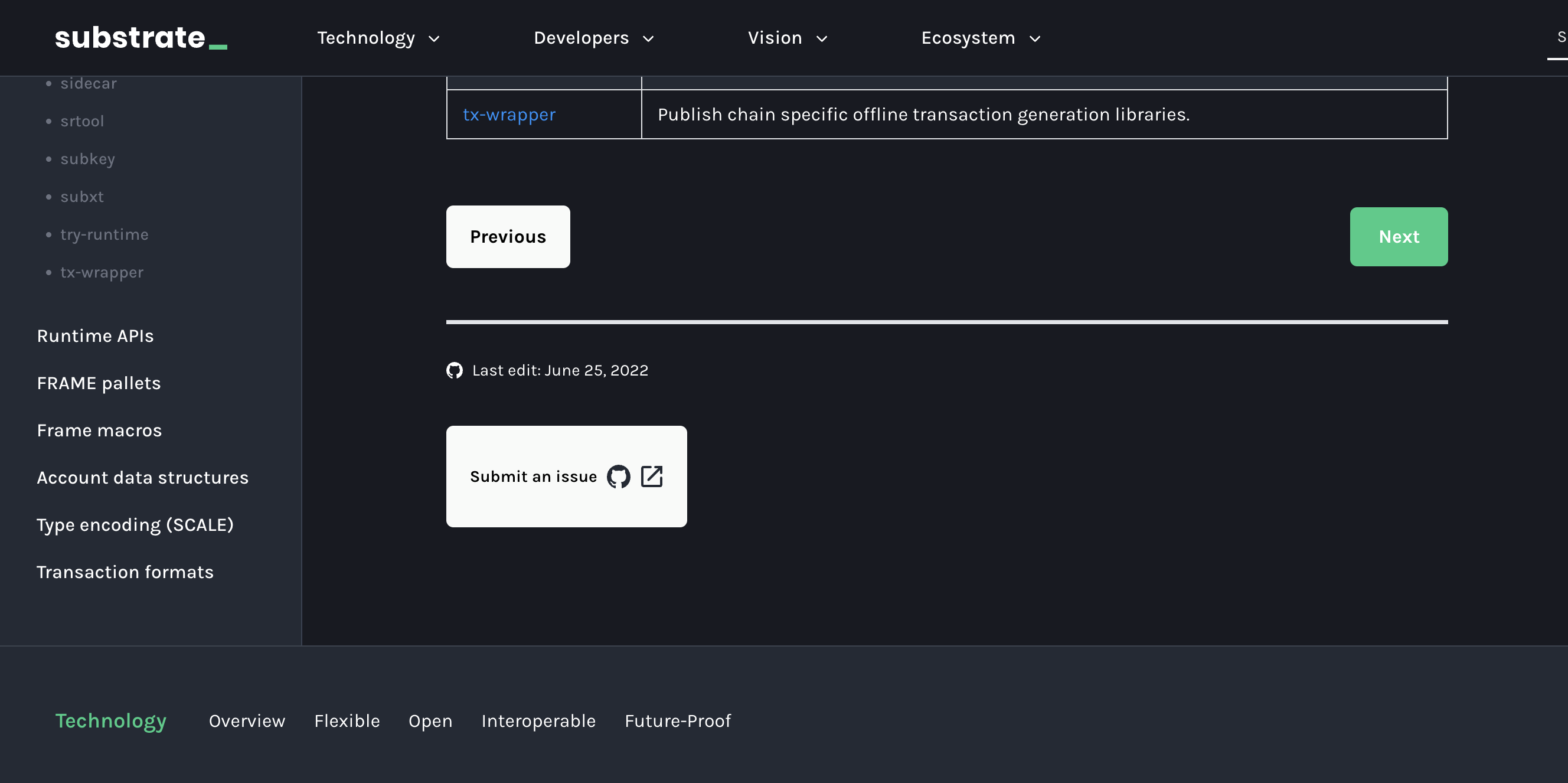
code looks good!

I still think these are a bit weak points in the UI:

  1. how the nav layout overflows the content in the middle of nowhere, could be solved by adding the line between sidebar and footer and cut there:

image

  1. the submit button imo gets too much space, could be at least smaller (like Docs header button), or more subtle design.

image

@rmnprkrl rmnprkrl added the webdev 🕸 This issue is assigned to @paritytech/webdev team label Jul 29, 2022
@lisa-parity
Copy link
Contributor

I think the left nav looks good.
I'd like the Submit an issue and Ask a question links to not be buttons-just text links without the box seems cleaner. I think they might be better served at the bottom of the page with a separator or at the bottom of the right nave so clearly not part of what's on this page.
I'd prefer getting rid of the two colored and two sized buttons for Previous and Next.
Maybe something like this:

< Submit a issue Ask a question >

(Above the standard black footer)

I like the idea of combining the Edit this page and last edited date, but wonder if it is too subtle. Maybe use the Edit icon (with tool tip) instead of the GitHub icon. Or go back to Edit this page, or Edit (link) and date no link?

@rmnprkrl
Copy link
Collaborator

the overflow should be set all the way down to the border with footer
image

@jonnysmillie jonnysmillie merged commit e8db5d1 into main Aug 17, 2022
@jonnysmillie jonnysmillie deleted the js/ia-restructure branch August 17, 2022 09:17
Sign up for free to join this conversation on GitHub. Already have an account? Sign in to comment

Labels

⛔ DO NOT MERGE ⛔ WIP! Changes needed. webdev 🕸 This issue is assigned to @paritytech/webdev team

Projects

None yet

Development

Successfully merging this pull request may close these issues.

4 participants