-
Notifications
You must be signed in to change notification settings - Fork 99
Open
Labels
Difficulty: BeginnerHackathon projects with beginner difficultyHackathon projects with beginner difficultyFsLab Hackathon 2023Implementation projects for the 2023 FsLab HackathonImplementation projects for the 2023 FsLab HackathonStatus: In Progress
Description
Description
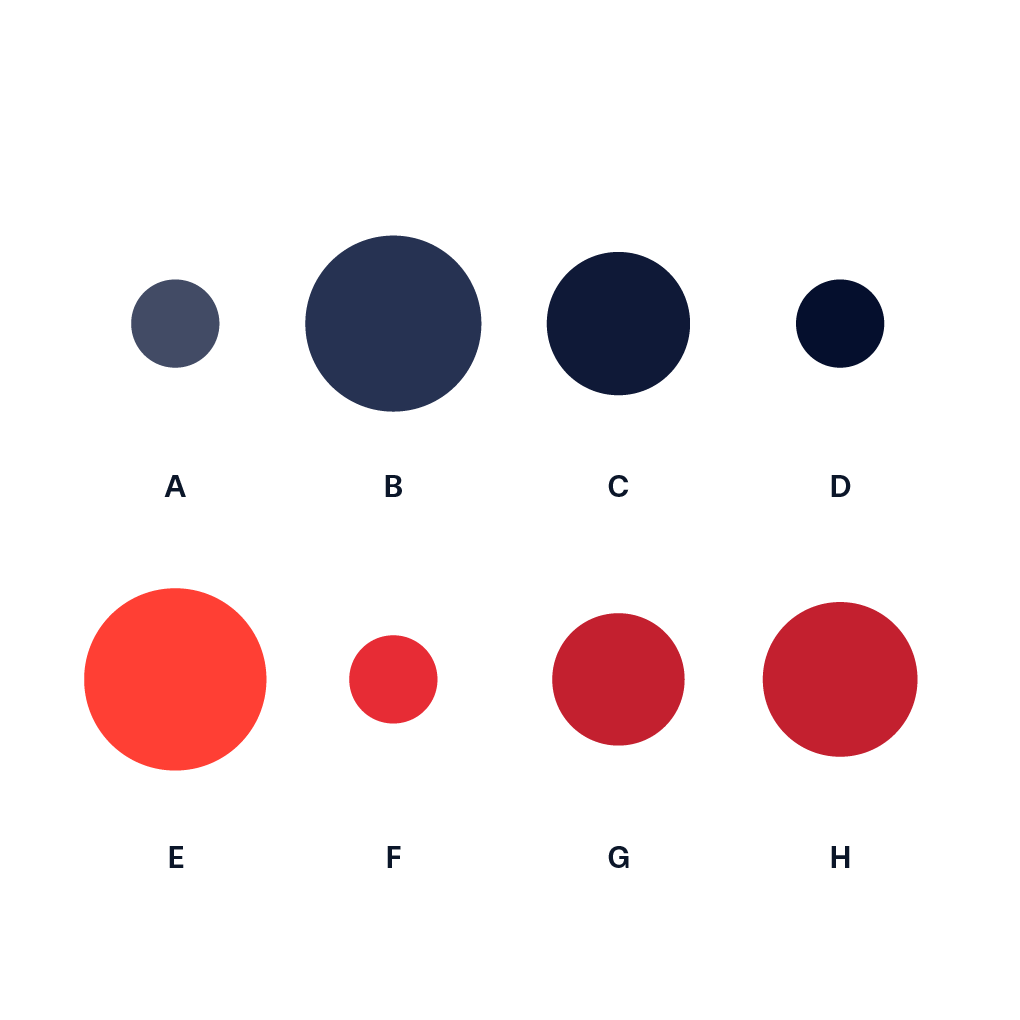
A Proportional Area Charts are used for comparing proportions (size, quantities, etc.) without the usage of scales. They are therefore only suitable to compare a small set of values, and usually should be combined with text annotations displaying the value [1, 2].
Example:
Pointers
- Ideally, you start prototyping in a scripting or notebook environment where you can iterate fast. installation instructions can be found here: https://plotly.net/#Installation
- Charts like this that are using baseline trace types to create a new chart type should only be implemented in the top-level Chart API. An example where this is already done is the Range chart that combines a set of differently styled line charts.
References
- [1] https://datavizproject.com/data-type/proportional-area-chart-circle/
- [2] https://datavizcatalogue.com/methods/area_chart.html
Hints (click to expand if you need additional pointers)
- This chart is basically a Bubble Chart with a single dimension (the bubble size). Your chart function should take care of the positioning of the bubbles
Metadata
Metadata
Assignees
Labels
Difficulty: BeginnerHackathon projects with beginner difficultyHackathon projects with beginner difficultyFsLab Hackathon 2023Implementation projects for the 2023 FsLab HackathonImplementation projects for the 2023 FsLab HackathonStatus: In Progress
