Skip to content

Conversation

jdugge
Copy link
Contributor

@jdugge jdugge commented Feb 28, 2020

This PR adds expression widgets for the colors of histograms, pie charts and box plots.

This allows specifying the colors of:

image

array_foreach(generate_series( 0, 1.01, 1/9 ),  ramp_color( 'RdYlGnBu', @element))

image

ramp_color( 'RdYlGnBu', ("IMDD15"-1)/9)
  • box plots (unfortunately, to get different colors for the individual boxes, it is necessary to use separate plots)

image

@ghtmtt
Copy link
Owner

ghtmtt commented Mar 3, 2020

great enhancement! User question: to get the same histogram color of a graduated layer classification, the user has to enter one of the expression you put in this PR text, right? I'm afraid some users will be scared by these expressions, what about adding a tooltip (or something similar)?

Finally we should also add this in the documentation.

@ghtmtt
Copy link
Owner

ghtmtt commented Mar 6, 2020

individual pie segments (fixes #167)

could you please share a small dataset sample? I'm trying to look deeper into this

@jdugge
Copy link
Contributor Author

jdugge commented Mar 6, 2020

to get the same histogram color of a graduated layer classification, the user has to enter one of the expression you put in this PR text, right?

Yes, that's right. One could write a function for use in the expression that makes this easier, but to really make this user friendly it would probably be better to have a check box "link colors to layer symbology"

I'm afraid some users will be scared by these expressions, what about adding a tooltip (or something similar)?

I've adjusted the help text in the expression editor now to mention the fact that the user can supply an array of colors rather than a single color name

Finally we should also add this in the documentation.

I'll add something to the documentation

could you please share a small dataset sample?

You can use the Natural Earth ne_10m_populated_places_simple dataset with the expression ramp_color( 'RdYlGnBu', ("scalerank" - 1)/9) to try this out.

@nyalldawson
Copy link
Collaborator

I'm afraid some users will be scared by these expressions, what about adding a tooltip (or something similar)?

Personally I don't see this as an issue -- they are standard QGIS expressions, and they can be auto-created via a UI by using the inbuilt "assistant" option.

@jdugge can you rebase this to fix the conflicts and add a unit test?

@jdugge jdugge force-pushed the color_expressions branch from b2db225 to a5e694c Compare March 31, 2020 19:36
@jdugge
Copy link
Contributor Author

jdugge commented Apr 14, 2020

I'll be glad to add a unit test, but I'm struggling a bit with getting the tests to run successfully again (in particular test_read_write_project_with_layout). Should the tests all be passing at the moment?

@jdugge jdugge force-pushed the color_expressions branch 4 times, most recently from bc9f41a to 3e4dd16 Compare April 15, 2020 20:14
@ghtmtt
Copy link
Owner

ghtmtt commented Apr 16, 2020

I'll be glad to add a unit test, but I'm struggling a bit with getting the tests to run successfully again (in particular test_read_write_project_with_layout). Should the tests all be passing at the moment?

Travis is giving us some problems due to an internal service migration, but I think you are testing also locally.

It is very important to test if QGIS projects saved with some DataPlotly configuration are not broken with the new feature. That's something I've on the ToDo list (to add project regression tests).

@jdugge jdugge force-pushed the color_expressions branch from 3e4dd16 to 37ff6cf Compare April 20, 2020 19:34
@jdugge jdugge force-pushed the color_expressions branch from f090990 to b87c804 Compare April 24, 2020 20:08
@jdugge
Copy link
Contributor Author

jdugge commented Apr 25, 2020

The tests are now basically passing (the tests time out with the latest QGIS version, but I don't think that has anything to do with the new features).
Could you give me some more details on what kind of tests I should add so this PR can be merged?

@ghtmtt
Copy link
Owner

ghtmtt commented Apr 27, 2020

@jdugge no problem for me! I'm still having some troubles to get the correct colors in the pie chart, with the expression ramp_color( 'Blues', ("Cases"-1)/9).

immagine

@jdugge
Copy link
Contributor Author

jdugge commented Apr 27, 2020

I'm still having some troubles to get the correct colors in the pie chart, with the expression ramp_color( 'Blues', ("Cases"-1)/9).

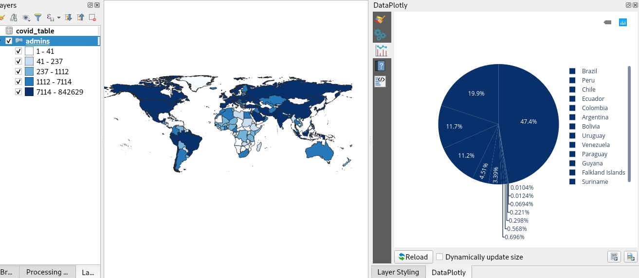
That expression would work if "Cases" was a field containing only the values of 0 to 9 (like the "scalerank" field in the Natural Earth populated_places dataset.

In your case, you would an expression like the following:

CASE
	WHEN "Deaths" < 41 THEN ramp_color('Blues', 0/4)
	WHEN "Deaths" < 237 THEN ramp_color('Blues', 1/4)
	WHEN "Deaths" < 1112 THEN ramp_color('Blues', 2/4)
	WHEN "Deaths" < 7114 THEN ramp_color('Blues', 3/4)
	ELSE ramp_color('Blues', 4/4)
END

It would be nice if the @symbol_color variable would be available in the DataPlotly context, then we could simply use that in the color expression.

@ghtmtt
Copy link
Owner

ghtmtt commented Apr 28, 2020

got it. I really think we should add this to the documentation. I can do it but I'll maybe ping you for a review.

Really nice new cool feature! Thanks @jdugge

@ghtmtt ghtmtt merged commit 74fbd4b into ghtmtt:master Apr 28, 2020
Sign up for free to join this conversation on GitHub. Already have an account? Sign in to comment

Labels

None yet

Projects

None yet

Development

Successfully merging this pull request may close these issues.

Add color attribute for histograms changing color for pie chart

3 participants