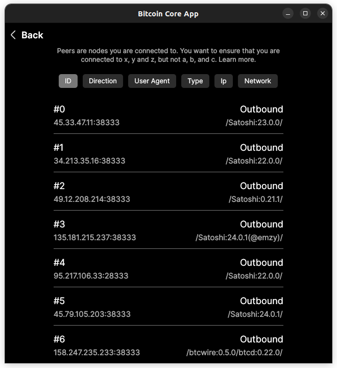
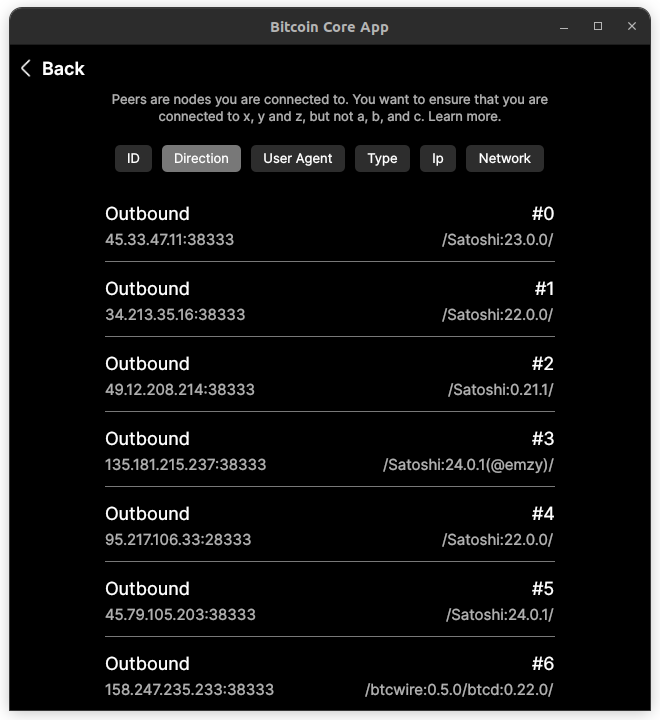
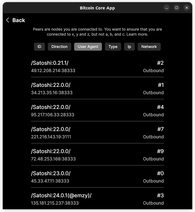
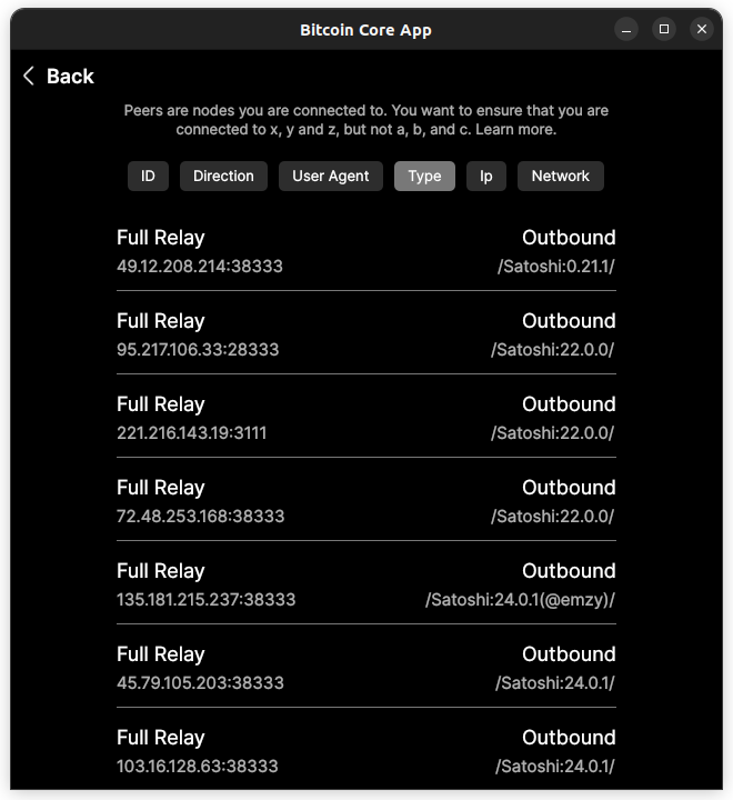
Add sorting bar to Peers page #268
Conversation
 johnny9
force-pushed
the
peers
branch
3 times, most recently
from
johnny9
force-pushed
the
peers
branch
3 times, most recently
from
2ca4ba1 to
8ab488f
Compare
johnny9
changed the title
johnny9
force-pushed
the
peers
branch
2 times, most recently
from
159bc04 to
c059cf3
Compare
|
 jarolrod
left a comment
jarolrod
left a comment
jarolrod
left a comment
There was a problem hiding this comment.
toggle button text color doesn't work on light mode
jarolrod
left a comment
jarolrod
left a comment
There was a problem hiding this comment.
Concept ACK
Diff on ToggleButton.qml
diff --git a/src/qml/controls/ToggleButton.qml b/src/qml/controls/ToggleButton.qml
index 05cf54e6a..ea72c5802 100644
--- a/src/qml/controls/ToggleButton.qml
+++ b/src/qml/controls/ToggleButton.qml
@@ -6,38 +6,30 @@ import QtQuick 2.15
 import QtQuick.Controls 2.15

 Button {
-    property color defaultColor: Theme.color.neutral2
-    property color hoverColor: Theme.color.neutral2
-    property color activeColor: Theme.color.neutral5
+    id: root
+    property color bgDefaultColor: Theme.color.neutral2
+    property color bgHoverColor: Theme.color.neutral2
+    property color bgActiveColor: Theme.color.neutral5
     property color textColor: Theme.color.neutral7
     property color textHoverColor: Theme.color.orangeLight1
     property color textActiveColor: Theme.color.neutral9
-    id: root
-    checkable: true
     hoverEnabled: true
-    font.family: "Inter"
-    font.styleName: "Regular"
-    font.pixelSize: 13
+    checkable: true
     leftPadding: 12
     rightPadding: 12
     topPadding: 5
     bottomPadding: 5

-    contentItem: Text {
+    contentItem: Header {
         id: buttonText
-        text: parent.text
-        font: parent.font
-        color: Theme.color.white
-        horizontalAlignment: Text.AlignHCenter
-        verticalAlignment: Text.AlignVCenter
-
-        Behavior on color {
-            ColorAnimation { duration: 150 }
-        }
+        header: root.text
+        headerSize: 13
+        headerColor: root.textColor
     }
+
     background: Rectangle {
         id: bg
-        color: root.defaultColor
+        color: root.bgDefaultColor
         radius: 5

         Behavior on color {
@@ -45,24 +37,22 @@ Button {
         }
     }

-    state:"DEFAULT"
+    state: "DEFAULT"

     states: [
         State {
             name: "DEFAULT"
-            PropertyChanges { target: bg; color: root.defaultColor }
+            PropertyChanges { target: bg; color: root.bgDefaultColor }
         },
         State {
-            name: "CHECKED"
-            when: root.checked
-            PropertyChanges { target: bg; color: root.activeColor }
-            PropertyChanges { target: buttonText; color: root.textActiveColor }
+            name: "CHECKED"; when: root.checked
+            PropertyChanges { target: bg; color: root.bgActiveColor }
+            PropertyChanges { target: buttonText; headerColor: root.textActiveColor }
         },
         State {
-            name: "HOVER"
-            when: root.hovered
-            PropertyChanges { target: bg; color: root.hoverColor }
-            PropertyChanges { target: buttonText; color: root.textHoverColor }
+            name: "HOVER"; when: root.hovered
+            PropertyChanges { target: bg; color: root.bgHoverColor }
+            PropertyChanges { target: buttonText; headerColor: root.textHoverColor }
         }
     ]
 }
diff on Peers.qml
diff --git a/src/qml/pages/node/Peers.qml b/src/qml/pages/node/Peers.qml
index 2d9b8b2af..546bbc6b2 100644
--- a/src/qml/pages/node/Peers.qml
+++ b/src/qml/pages/node/Peers.qml
@@ -30,11 +30,12 @@ Page {
         horizontalAlignment: Text.AlignHCenter
     }

-    RowLayout {
+    Flow {
         id: sortSelection
         anchors.top: description.bottom
         anchors.topMargin: 20
         anchors.horizontalCenter: parent.horizontalCenter
+        width: Math.min(parent.width - 40, 450)
         spacing: 10
         ToggleButton {
             text: qsTr("ID")
johnny9
force-pushed
the
peers
branch
4 times, most recently
from
e1cc8d0 to
b36b8d5
Compare
|
Above fixes for lightmode and togglebutton wrapping: |
|
Rebase? |
#274 |
|
Needs rebase again :) |
jarolrod
left a comment
jarolrod
left a comment
There was a problem hiding this comment.
ACK a46d12d
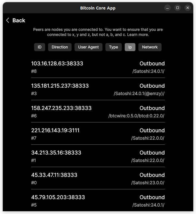
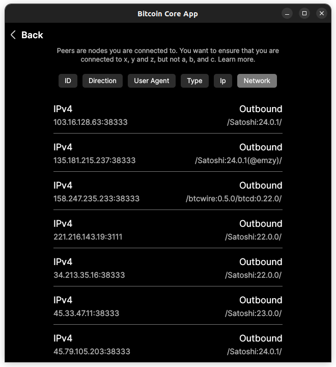
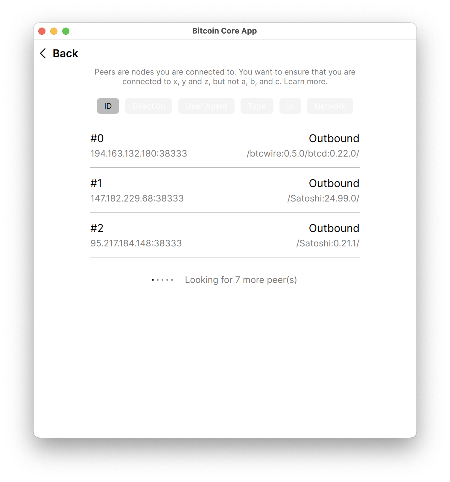
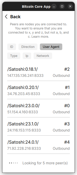
One thing to note is I believe that the toggle buttons have three states, selected, selected again, not selected. When selected again it should reverse the sorting order; so if selected is least to greatest, selected again would be greatest to least. We can connect with christoph about this soon.
725693c qml: Add sorting bar to Peers page (johnny9) Pull request description: [](https://api.cirrus-ci.com/v1/artifact/github/bitcoin-core/gui-qml/win64/insecure_win_gui.zip?branch=pull/268) [](https://api.cirrus-ci.com/v1/artifact/github/bitcoin-core/gui-qml/macos/insecure_mac_gui.zip?branch=pull/268) [](https://api.cirrus-ci.com/v1/artifact/github/bitcoin-core/gui-qml/macos_arm64/insecure_mac_arm64_gui.zip?branch=pull/268) [](https://api.cirrus-ci.com/v1/artifact/github/bitcoin-core/gui-qml/android/insecure_android_apk.zip?branch=pull/268) ACKs for top commit: jarolrod: ACK 725693c Tree-SHA512: e94c6539c49f9e8b1b7a2ecb4d738d8c8b292a3d26d00d8d6789cbf15b2871b6c2553f870b414a0fee23a55d17e2e6cd4a10194b01e228057cbd3af5f02be5cd
725693cb34a80c585937e175738f6ce23179060d qml: Add sorting bar to Peers page (johnny9) Pull request description: [](https://api.cirrus-ci.com/v1/artifact/github/bitcoin-core/gui-qml/win64/insecure_win_gui.zip?branch=pull/268) [](https://api.cirrus-ci.com/v1/artifact/github/bitcoin-core/gui-qml/macos/insecure_mac_gui.zip?branch=pull/268) [](https://api.cirrus-ci.com/v1/artifact/github/bitcoin-core/gui-qml/macos_arm64/insecure_mac_arm64_gui.zip?branch=pull/268) [](https://api.cirrus-ci.com/v1/artifact/github/bitcoin-core/gui-qml/android/insecure_android_apk.zip?branch=pull/268) ACKs for top commit: jarolrod: ACK 725693cb34a80c585937e175738f6ce23179060d Tree-SHA512: e94c6539c49f9e8b1b7a2ecb4d738d8c8b292a3d26d00d8d6789cbf15b2871b6c2553f870b414a0fee23a55d17e2e6cd4a10194b01e228057cbd3af5f02be5cd
3 participants
Uh oh!
There was an error while loading. Please reload this page.