动画性能分析和实现拆解 #14
Description
动画性能分析
一、开启性能检测工具
- 首先是打开控制台的
rendering,开启Paint flashing(观察重绘元素)和Frame Rendering Status(查看GPU使用情况)
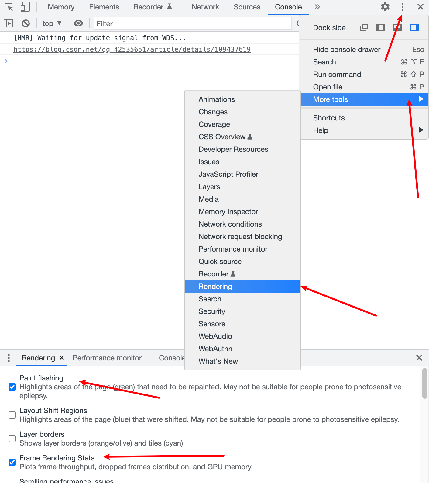
- 然后同样方式找到
Performance monitor(查看CPU使用率)
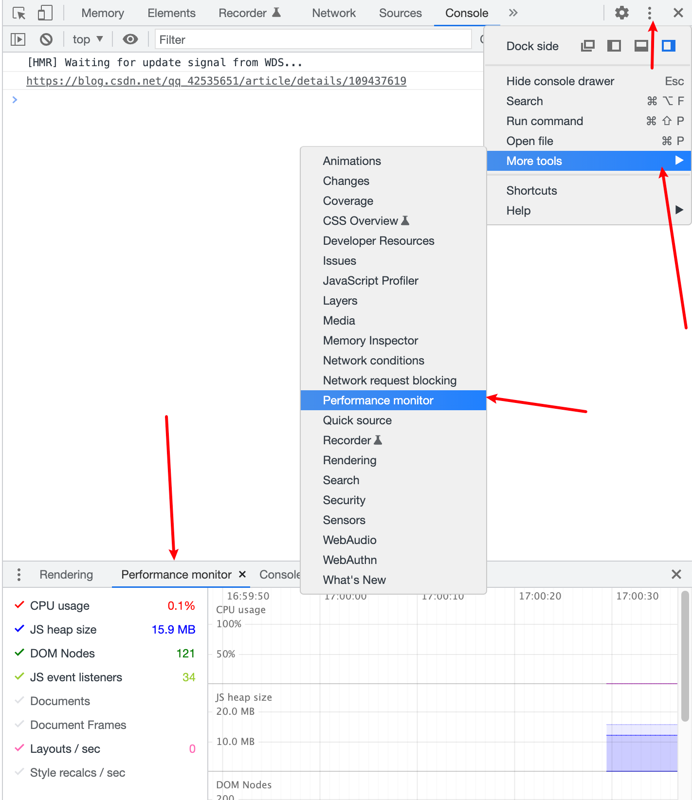
二、分析性能
之后就是根据Frame Rendering Status和Performance monitor面板显示信息分析动画的性能。
三、举个栗子
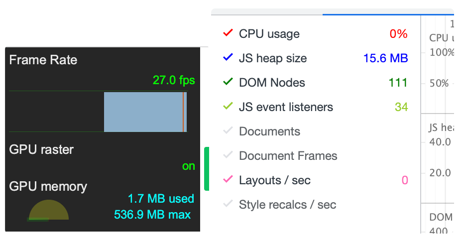
拿曾经开发的一个demo:
我用了三种方式去实现这个动画,分别是transform、height、canvas
记录下未有动画时的信息:GPU:1.7MB CPU:0% JS:15.6M
以下分别是各方案的信息:
1、transform:GPU:3.4MB CPU:0.1% JS:16.8M (最好)
2、height: GPU:5.0MB CPU:3.6% JS:16.8M (较差)
3、canvas: GPU:3.3MB CPU:2.8% JS:16.8M (中等)
通过Paint flashing我们还可以看到,方案1没有元素重绘,这是因为transform不会触发重排重绘,方案2三个dom元素重绘,方案3仅一个canvas元素重绘。
从以上信息可以总结,通过transform实现动画是优于其他两个的,但canvas是否一定比transform差呢?不是!如果动画的元素很多,这时候canvas的优势就会体现出来。因此,一般情况下我们实现动画都是优先考虑css(其中使用transform优于top\left\right\bottom\width\height),然后才是js动画,这里的例子没有通过js去计算每一帧的状态然后改变样式,没有必要,因为css能实现的没必要用js。canvas实际上就是每一帧使用js计算绘制的信息,反复的清除和绘制画布。
参考链接:https://www.imgeek.org/article/825357442
动画拆解
动画案例
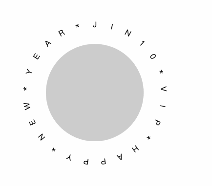
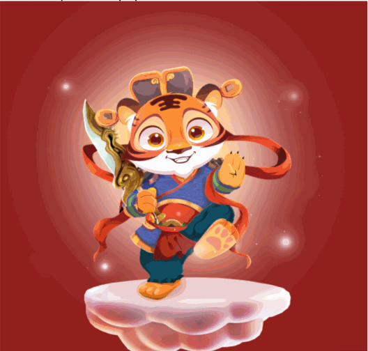
需要实现的效果是这样的,原来是使用了图片序列帧的方案,不考虑网速和性能的情况下是很好的,毕竟百分百还原了设计师的要求。
这方案的缺点:如果网络差,使用预加载全部图片后才开始动画会需要很长时间才能开始动画,如果使用先加载一张,加载完毕才加载下一张这样轮动,就会因为网络问题显得不流畅。最重要的原因是消耗的流量太多,好说也是几百张图片,最后加起来几十兆的资源。
因此,我打算用css来实现动画,以下是我实现的思路
一、确定在动的元素
- 老虎和脚下的云一个整体,我们假设为一个图片或者div(效果是上下漂浮);
- 环绕的文字(效果是自转);
- 间隔光照效果(效果是从左上到右下划过)。
二、确定核心元素
第1和第2点无疑是整个动画的核心,第3点观察上面的demo,没有光划过的时候也没怎么样嘛,也就是说这个动画是为其增添一份色彩和灵动的,非核心。如果事不可为,大可不为,反正量力而为~
三、分步骤实现
第1点没难度,一个div或图片在上下漂浮;
第2点,动画是旋转,这个效果也是没难度,难点在于怎么让文字环绕中心元素。
为了方便,下面示例采用圆来模拟老虎:
1、环形文字效果
<template>
  <div class="round-text">
    <!-- 容器 -->
    <div class="wrapper">
      <!-- 环绕对象 -->
      <div class="ball" />
      <!-- 文字 -->
      <div
        ref="text"
        class="text"
      />
    </div>
  </div>
</template>

<script>
  export default {
    name: 'RoundTextFirst',
    mounted() {
      this.initText(this.$refs.text, 'JIN10*VIP*HAPPY*NEW*YEAR*')
    },
    methods: {
      // 核心逻辑!!!
      initText(element, str = 'hello word!') {
        const text = str
        // eslint-disable-next-line no-param-reassign
        element.innerHTML = ''
        for (let i = 0; i < text.length; i++) {
          const letter = text[i]
          const iTag = document.createElement('i')
          // iTag.setAttribute('style', 'display: inline-block;font-style: normal;transform-origin: center center;transform: rotateX(90deg);')
          const span = document.createElement('span')
          const node = document.createTextNode(letter)
          const deg = (360 / text.length) * i
          const xValue = Number((Math.PI / text.length).toFixed(0)) * i
          const yValue = Number((Math.PI / text.length).toFixed(0)) * i
          iTag.appendChild(node)
          span.appendChild(iTag)
          const spanStyle = 'position: absolute;left: 0;right: 0;top: 0;bottom: 0;'
          span.setAttribute('style', spanStyle)
          span.style.transform = `rotateZ(${deg}deg) translate3d(${xValue}px,${yValue}px,0)`
          element.appendChild(span)
        }
      },
    },
  }
</script>
<style lang="scss" scoped>
  .round-text {
    @keyframes vertical {
      10%,
      30%,
      50%,
      70% {
        transform: translateY(-8px);
      }
      20%,
      40%,
      60% {
        transform: translateY(8px);
      }
      80% {
        transform: translateY(6.4px);
      }
      90% {
        transform: translateY(-6.4px);
      }
    }
    .wrapper {
      position: relative;
      padding-left: 100px;
      padding-top: 100px;
    }
    .ball {
      width: 200px;
      height: 200px;
      border-radius: 50%;
      background-color: #ccc;
      animation: vertical 12s linear infinite;
    }
    /* 文字容器,宽高要比环绕对象大 */
    // 核心样式!!!
    .text {
      position: absolute;
      left: 50px;
      top: 50px;
      height: 300px;
      width: 300px;
      text-align: center;
      // transform-style: preserve-3d; // 设置元素的子元素是位于3D空间还是平面,由于该属性不会被继承,因此必须为元素的所有非叶子子元素设置它
      ::v-deep {
        // span {
        //   transform-style: preserve-3d;
        // }
        i {
          font-style: normal;
        }
      }
    }
  }
</style>
原理就是根据文字数量来计算旋转角度,然后给每个文字一个占满宽高水平居中的样式,以达到旋转后是环形的效果。
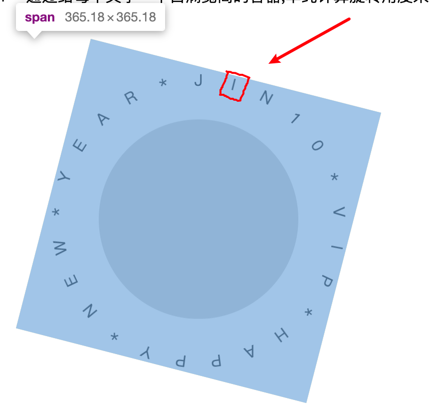
2、把文字容器旋转达到需求效果中的角度
我们给文字容器增加一句样式:transform: rotateX(-116deg) rotateY(18deg);
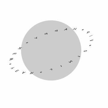
3、把文字立起来
把上面代码示例中的行31、行90、行92~94取消注释,此时效果有个80%了
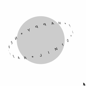
4、给文字容器加上自转的动画样式
animation: rotate 16s linear infinite;
@keyframes rotate {
  from {
    transform: rotateX(-116deg) rotateY(18deg) rotateZ(0);
  }
  to {
    transform: rotateX(-116deg) rotateY(18deg) rotateZ(360deg);
  }
}
效果达到90%了!!!
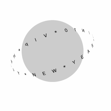
5、旋转到背后的文字应该被遮挡
结合现实,文字应该是围绕球体的,尝试了平移zindex都无法使背后的文字被球体遮挡,然后找了一些关于星体旋转的css动画,看了某句话想到了,直接拿球体的上半部分进行一个遮挡,这样就能模拟真实情况了
- 在文字容器后的html中添加:
<div class="ball-mask" /> - 给
.ball-mask添加样式(这里上半部分的动画和底下圆的动画会有些不一样,因为已经用了rotate,如果结合translate会产生复合效果,和原来的有偏差,因此通过top来控制上下漂浮,距离的像素值是一样的)
@keyframes vertical2 {  // 底下圆的动画vertical使用的是translateY
  10%,
  30%,
  50%,
  70% {
    top: 92px;
  }
  20%,
  40%,
  60% {
    top: 108px;
  }
  80% {
    top: 106.4px;
  }
  90% {
    top: 93.6px;
  }
}
.ball-mask {
  position: absolute;
  top: 100px;
  left: 100px;
  width: 200px;
  height: 100px;
  border-radius: 100px 100px 0 0;
  background-color: #ccc;
  transform-origin: center 100%;
  transform: rotateZ(-20deg);
  animation: vertical2 12s linear infinite;
}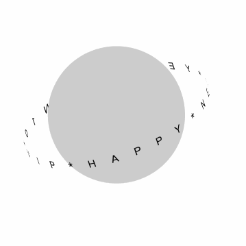
核心效果100%了,最后把它换成实际需求的图片、文案即可。
最终示例完整的代码是:
<template>
  <div class="round-text">
    <!-- 容器 -->
    <div class="wrapper">
      <!-- 环绕对象 -->
      <div class="ball" />
      <!-- 文字 -->
      <div
        ref="text"
        class="text"
      />
      <!-- 环绕对象的一部分,遮挡文字塑造立体的效果 -->
      <div class="ball-mask" />
    </div>
  </div>
</template>

<script>
  export default {
    name: 'RoundTextFirst',
    mounted() {
      this.initText(this.$refs.text, 'JIN10*VIP*HAPPY*NEW*YEAR*')
    },
    methods: {
      initText(element, str = 'hello word!') {
        const text = str
        // eslint-disable-next-line no-param-reassign
        element.innerHTML = ''
        for (let i = 0; i < text.length; i++) {
          const letter = text[i]
          const iTag = document.createElement('i')
          iTag.setAttribute(
            'style',
            'display: inline-block;font-style: normal;transform-origin: center center;transform: rotateX(90deg);',
          )
          const span = document.createElement('span')
          const node = document.createTextNode(letter)
          const deg = (360 / text.length) * i
          const xValue = Number((Math.PI / text.length).toFixed(0)) * i
          const yValue = Number((Math.PI / text.length).toFixed(0)) * i
          iTag.appendChild(node)
          span.appendChild(iTag)
          const spanStyle = 'position: absolute;left: 0;right: 0;top: 0;bottom: 0;'
          span.setAttribute('style', spanStyle)
          span.style.transform = `rotateZ(${deg}deg) translate3d(${xValue}px,${yValue}px,0)`
          element.appendChild(span)
        }
      },
    },
  }
</script>
<style lang="scss" scoped>
  .round-text {
    @keyframes vertical {
      10%,
      30%,
      50%,
      70% {
        transform: translateY(-8px);
      }
      20%,
      40%,
      60% {
        transform: translateY(8px);
      }
      80% {
        transform: translateY(6.4px);
      }
      90% {
        transform: translateY(-6.4px);
      }
    }
    .wrapper {
      position: relative;
      padding-left: 100px;
      padding-top: 100px;
    }
    .ball {
      width: 200px;
      height: 200px;
      border-radius: 50%;
      background-color: #ccc;
      animation: vertical 12s linear infinite;
    }
    @keyframes rotate {
      from {
        transform: rotateX(-116deg) rotateY(18deg) rotateZ(0);
      }
      to {
        transform: rotateX(-116deg) rotateY(18deg) rotateZ(360deg);
      }
    }
    /* 文字容器,宽高要比环绕对象大 */
    .text {
      position: absolute;
      left: 50px;
      top: 50px;
      height: 300px;
      width: 300px;
      text-align: center;
      // 渲染达到环绕效果
      transform: rotateX(-116deg) rotateY(18deg);
      transform-style: preserve-3d;
      animation: rotate 16s linear infinite;
      ::v-deep {
        span {
          transform-style: preserve-3d;
        }
        i {
          font-style: normal;
        }
      }
    }
    @keyframes vertical2 {
      10%,
      30%,
      50%,
      70% {
        top: 92px;
      }
      20%,
      40%,
      60% {
        top: 108px;
      }
      80% {
        top: 106.4px;
      }
      90% {
        top: 93.6px;
      }
    }
    .ball-mask {
      position: absolute;
      top: 100px;
      left: 100px;
      width: 200px;
      height: 100px;
      border-radius: 100px 100px 0 0;
      background-color: #ccc;
      transform-origin: center 100%;
      transform: rotateZ(-20deg);
      animation: vertical2 12s linear infinite;
    }
  }
</style>前面说到第3点有个间隔光照效果,可以参考:https://www.jianshu.com/p/1cf170256711
实现出来大概是这样,缺点很明显,就是光照会是一整个div,而无法局部于图片的内容元素,所以这个动画还是不要反而更合适。
四、总结
动画更多的是为了提高美观性和体验,我们不是非要百分百的去还原,同时也要以前端的角度去考虑性能、可实现性和难度,对于不擅长写动画的人来说,实现一个动画往往需要耗费大量时间,一切应优先保证可用性。
下面推荐一些帮助开发动画的工具:
贝塞尔曲线生成器: https://cubic-bezier.com/#.17,.67,.83,.67
css动画可视化工具: https://animista.net/
AE动画: https://www.yuque.com/lottie/document/web