FAQ/unicode_entry Unicode characters that look alike #1444
Description
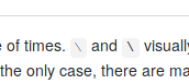
This issue was mentioned a couple of times. ∖ and \ are visually too similar. Worse, sometimes they are even rendered identically. But this is not the only case, there are many non-ascii characters that look like something else. How to deal with this stuff?
As an example, here are some screenshots of how it's rendered for me:
Emacs:

Firefox:
You'll notice that my emacs screenshot clearly shows that these characters are different. However, there's nothing clever about this:
my recommendation is really stupid. I'm using bitmap fonts for everything, these typically don't have the whole unicode range, so it falls back to any font that the system has with that glyph. This way, ascii range renders sharp and everything else is noticeably blurry
Anyway, I think that the proper solution would be to configure your editor to highlight characters out of ascii range (similarly to how people highlight whitespace). After some experiments I'll write about it.