Use common color map setup for all plots with color maps #313
Conversation
All support either contours (via indexed colormaps) or continuous
plotting (via a norm).  Tick marks can be specified (optionally)
differently from contour levels.
|
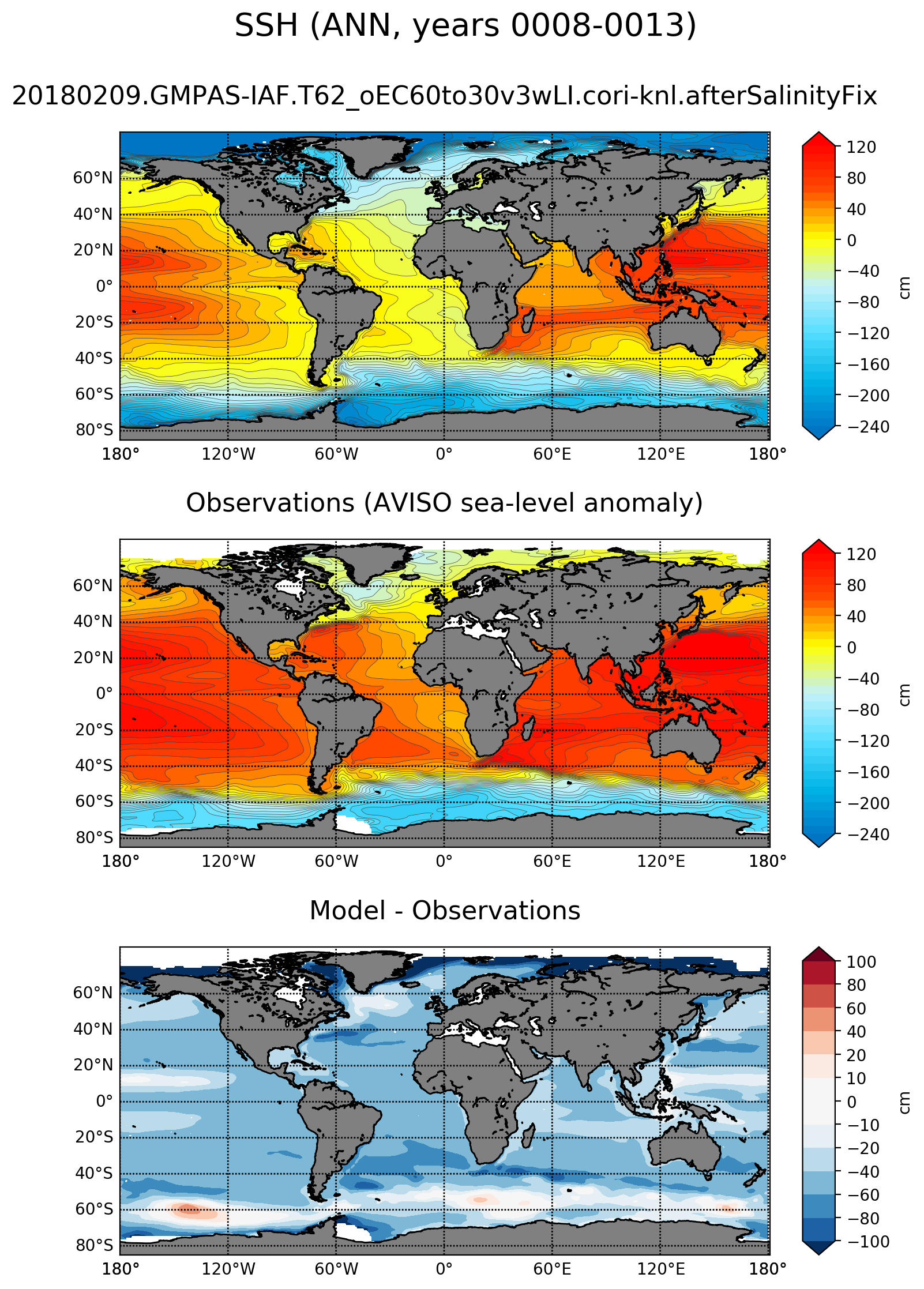
Here is an example of an SSH plot from this branch: I'm happy with this but it would also be easy to go back to the |
|
Wow! That is really beautiful! I love the bright colors with the contours. I wonder if the AVISO data does not have a zero mean for SSH. Zero is arbitrary, of course. MPAS-O begins with an actual mean SSH of zero, but can drift with P&E. By visual integration, AVISO looks positive, so the diff is confusing. That is really a topic for a different issue. |
|
@mark-petersen, that's a good point. My guess is that it's the offset from a reference surface of some kind but @maltrud and @milenaveneziani would have a better idea. It would be somewhat risky to adjust AVISO to have zero mean, given that it has a lot of missing values in polar regions where the SSH has its most negative values in MPAS-O. I'm definitely open to suggestions. |
|
I suppose one option would be to just shift AVISO (or MPAS-O) SSH by a constant value so the mean model-data mismatch is zero (on the assumption that the mean offset between the 2 is not meaningful). |
|
I believe my title for the observation are incorrect and that this is the AVISO absolute dynamic topography above the geoid. @milenaveneziani, can you confirm, since I think you downloaded the data? That doesn't really answer the question of what we should do about the systematic offset between the model and the observations. |
|
Here is the analysis for an example run with ice-shelf cavities: Everything except SSH should look the same and indeed I think it does, though I didn't do a careful comparison of each and every figure. |
|
@xylar code looks good. I'm testing now. In my high res test I see this error I assume this is okay as I don't have a land ice in this run. But it might be nice to not have a valueError if config_land_ice_flux_mode is not enabled. Or would it make more sense to have the default set of analysis run not include land ice melt time series and maps? |
|
It’s better if you disable this analysis by using no_landIceCavities as part of the generate option in your config file. That’s the case for a bunch of our example config files. |
|
Ah, of course. I realize I was running this test from the command line without that option. It's already in my config files. Sorry for that mix-up I successfully tested on 18to6 and even tinkered with the options for other fields like MLD. It works great! Thanks @xylar |
|
I agree, the SSH plots are beautiful. let me double check the observations website, but I think you are right: it is absolute dynamic height. |
|
Actually, the observations are mean sea-level anomalies (msla), computed with respect to the 20-year mean for which the data was taken. So maybe I would just change the title to 'AVISO mean sea-level anomaly)'. |
|
@milenaveneziani, are you sure the zos field is an anomaly field? My web search suggested it was an absolute deviation from the geoid and that makes more sense to me. I think we are looking at precisely the field (the 1993-2010 climatology) that is used as the baseline for the anomalies. That is, the climatology of the anomalies should be zero by definition. |
|
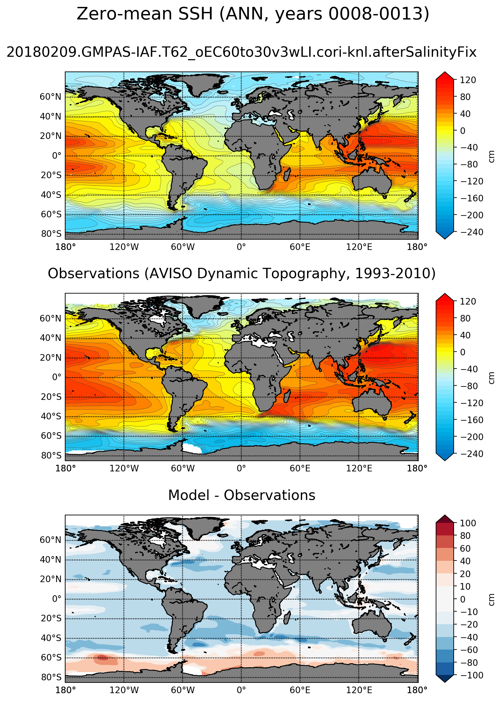
@milenaveneziani, I like your suggestion of removing the mean from both. Would we do that before or after regridding? Would we do that for all cells or only cells not masked out by either MPAS-O or AVISO? It probably doesn't matter a whole lot but could matter some. |
|
@xylar and @milenaveneziani you should remove the mean from the model, too. we only care about the mean when we're doing sea level rise. a question: what field is being plotted? is it the pressure adjusted SSH? that's what we want, not the actual SSH. |
|
@milenaveneziani, the link I can find for the particular file I used is here: If you search for "dynamic topography", you see: So I think the title should be |
|
@maltrud, it's the SSH, not the pressure-adjusted SSH. I agree we want the latter, and that probably explains why we're so deep in the polar regions. I'll fix that. |
Also change to pressure-adjusted SSH and change some of the title
text.
|
@vanroekel, thanks very much for the testing. I think you tested feature combinations I hadn't tried yet so I'm both pleased and a little surprised that things worked! |
|
Here's the result of removing the mean independently for MPAS-O and AVISO: This is now with the pressure-adjusted SSH. The fact that there's still a systematic offset between the two might suggest that we need to try removing the mean over the region where both data sets are valid. I'll do this in a new commit and see if it works. (We can always remove the commit if we decide it doesn't improve the result.) |
|
That seems to have done the trick: |
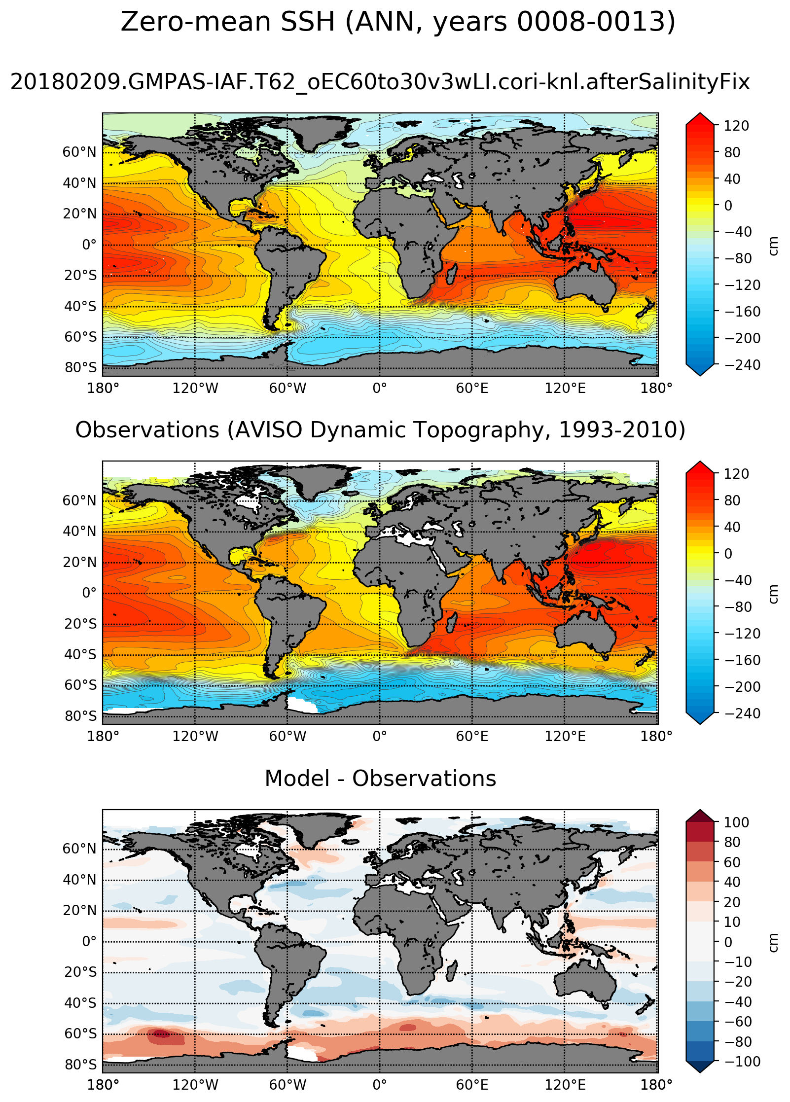
This leads to a bias plot that just shows differences in spatial
pattern, not mean offsets.
|
Okay, @maltrud, @mark-petersen and @milenaveneziani, let me know if you're happy with the result now. |
|
Great @xylar.
yeah, I think you are right, I need to correct my notes. |
|
@xylar it looks good. still SSH, not pressure adjusted, though, right? |
| tags=['climatology', 'horizontalMap', fieldName]) | ||
|
|
||
| mpasFieldName = 'timeMonthly_avg_ssh' | ||
| mpasFieldName = 'timeMonthly_avg_pressureAdjustedSSH' |
There was a problem hiding this comment.
@maltrud, yes this is now with pressure-adjusted SSH.
|
I'm going to go ahead an merge this. @maltrud, i assume since this is using the pressure-adjusted SSH now, you're happy with it... |
All these tasks now support a choice of either contours (via indexed color maps) or continuous plotting (via a "norm"). Tick marks can be specified (optionally) differently from contour levels.
Contour lines can also be plotted on top of any plot by specifying contour values, a color for contours and a line width.
These changes generalize and consolidate some redundant code related creating color maps.
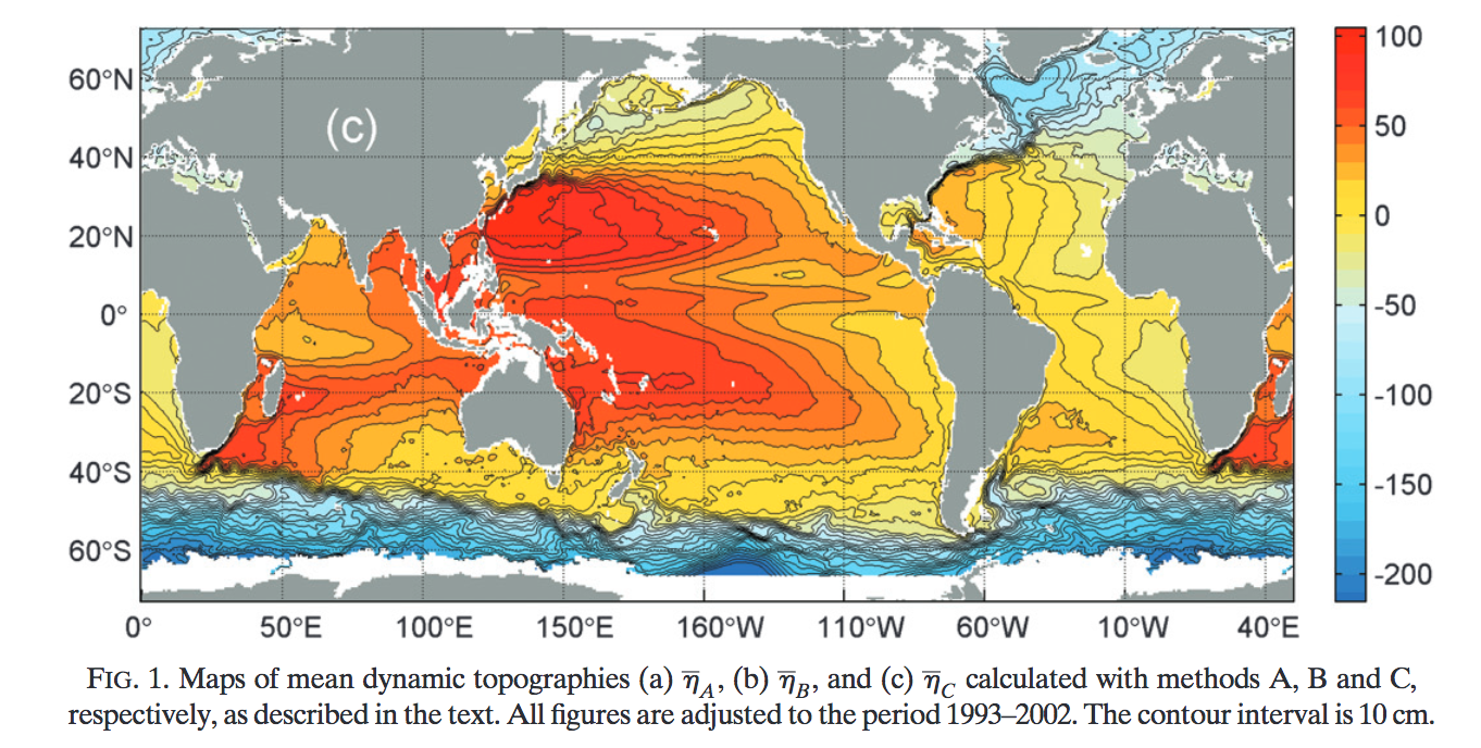
The changes also enable a new SSH plot, similar to Maximenko et al. (2009):