Add a task for plotting the sea surface height vs. obs #308
Conversation
|
This is a revival of #279, since it seems like a task to compare SSH with obs. might, in fact, be useful. @mark-petersen wants to include one such plot in the MPAS-O paper. |
|
@vanroekel and @milenaveneziani, could you each do a quick run with I have made sure the necessary observations are on Edison but I'm not sure if they have been copied over to other machines. Please let me know if you find them to be missing. |
|
@mark-petersen, I know you're busy with the paper so all I would want from you is verification that the figure looks like what you were after, once we have an example plot posted here. |
59a7465 to
61c20c8
Compare
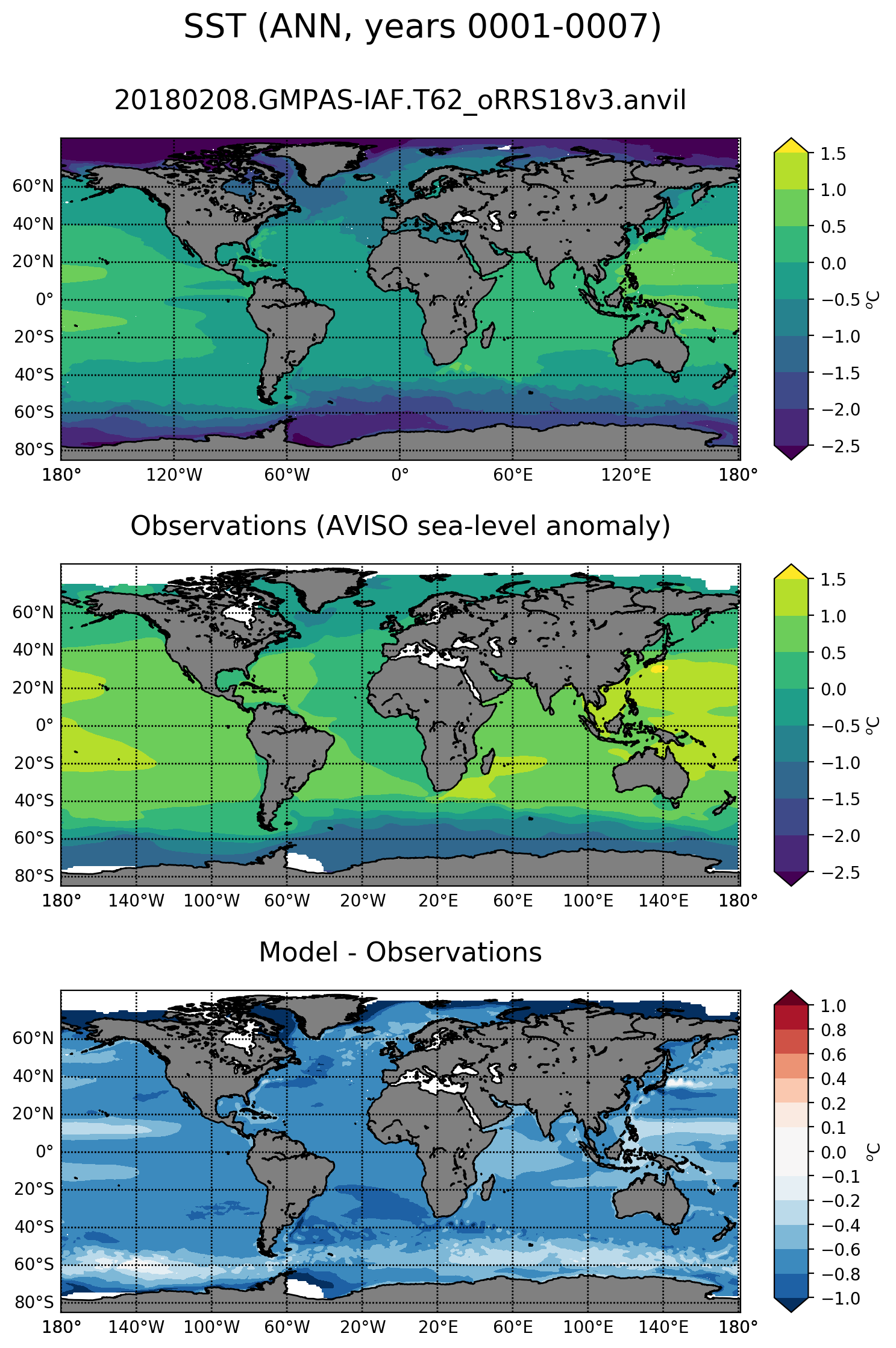
TestingI ran with both the QU240 test case on my laptop and the following EC60to30v3wLI test case: Please comment on the color map and the range. I will be fixing the values near zero similar to #311. |
76dcf19 to
b49b15d
Compare
|
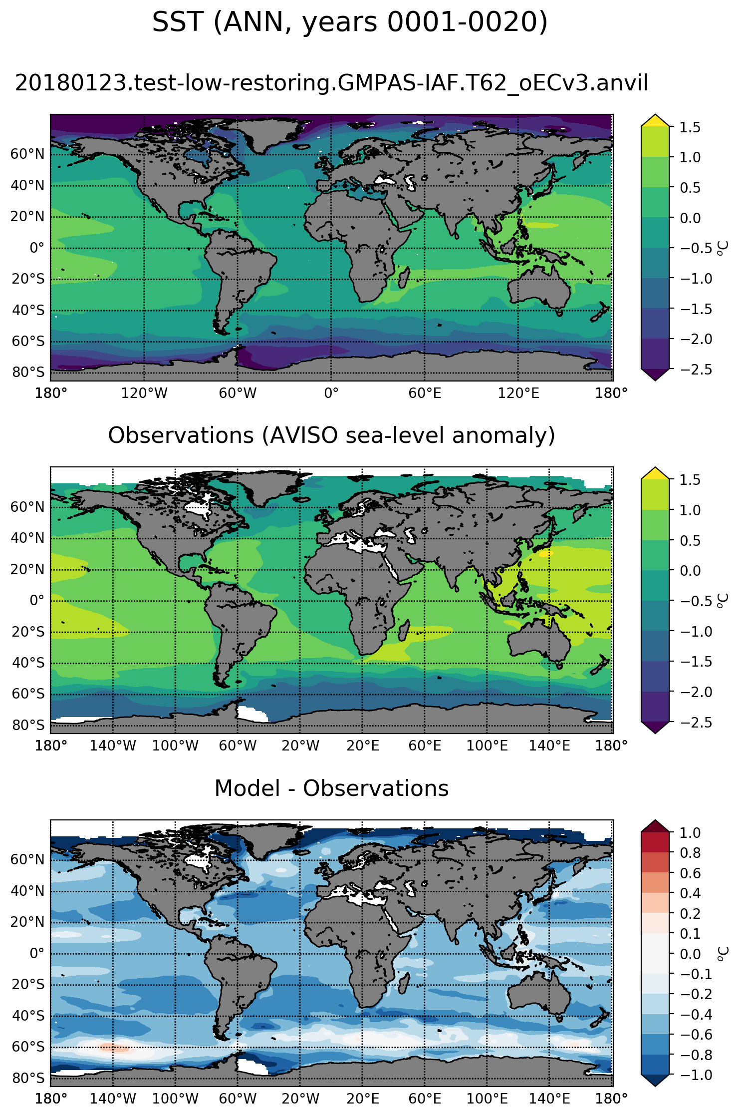
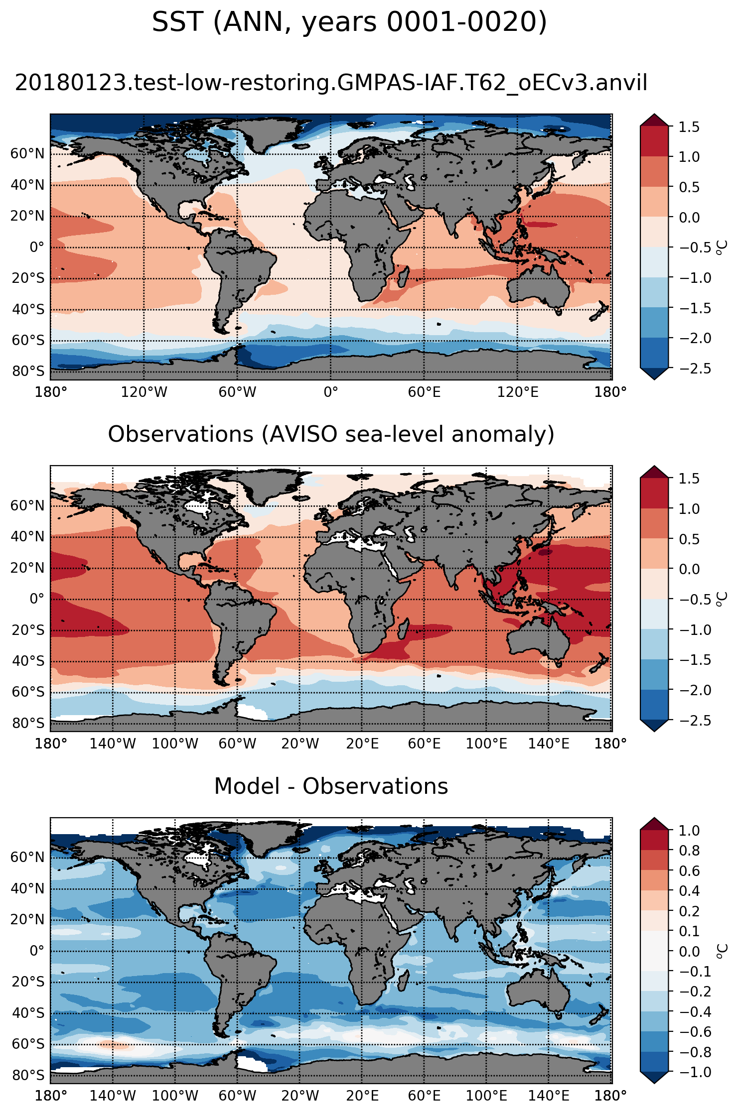
@xylar tested on 60to30 and 30to10 on anvil and things worked great. Examples below I do think a tighter range would be good. It is hard to see detail in this range. Perhaps also a diverging colormap like the red blue one might make features more visible? |
|
I have a suggestion for a colormap. I quite like the Spectral_r, with the following color indeces: |
|
|
||
| subtask.set_plot_info( | ||
| outFileLabel=outFileLabel, | ||
| fieldNameInTitle='SST', |
|
ah, also, I noticed we need to adjust title and units to 'SSH' and 'cm' (I suppose). |
|
here is a version with the RdBu color map. It is a bit clearer to my eye |
|
oops, need to fix the colors. I see negative values with red. |
|
@milenaveneziani, good catch. Units are meters. As far as color maps, I'll try your suggestion. Spectral_r seems like a good option and I don't think we've used it for other plots. |
|
@vanroekel's choice is nice too (to make it symmetric wrt 0 we need to change the levels, which may not be great in this case because SSH is way more negative than positive). |
|
I think spectral_r is nice for this too. Here is an example |
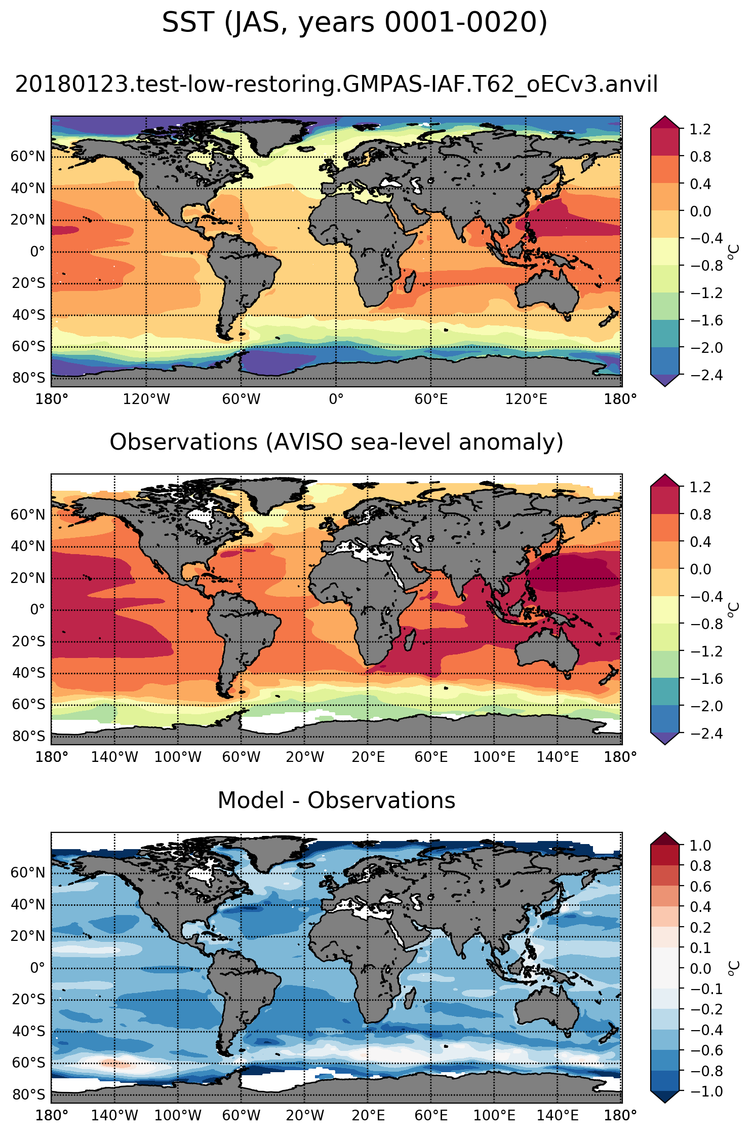
Uses the AVISO time series on the 1 degree grid.
|
Great, I think we're on to something. My plots look very similar to Luke's above. Check the link under testing again. |
|
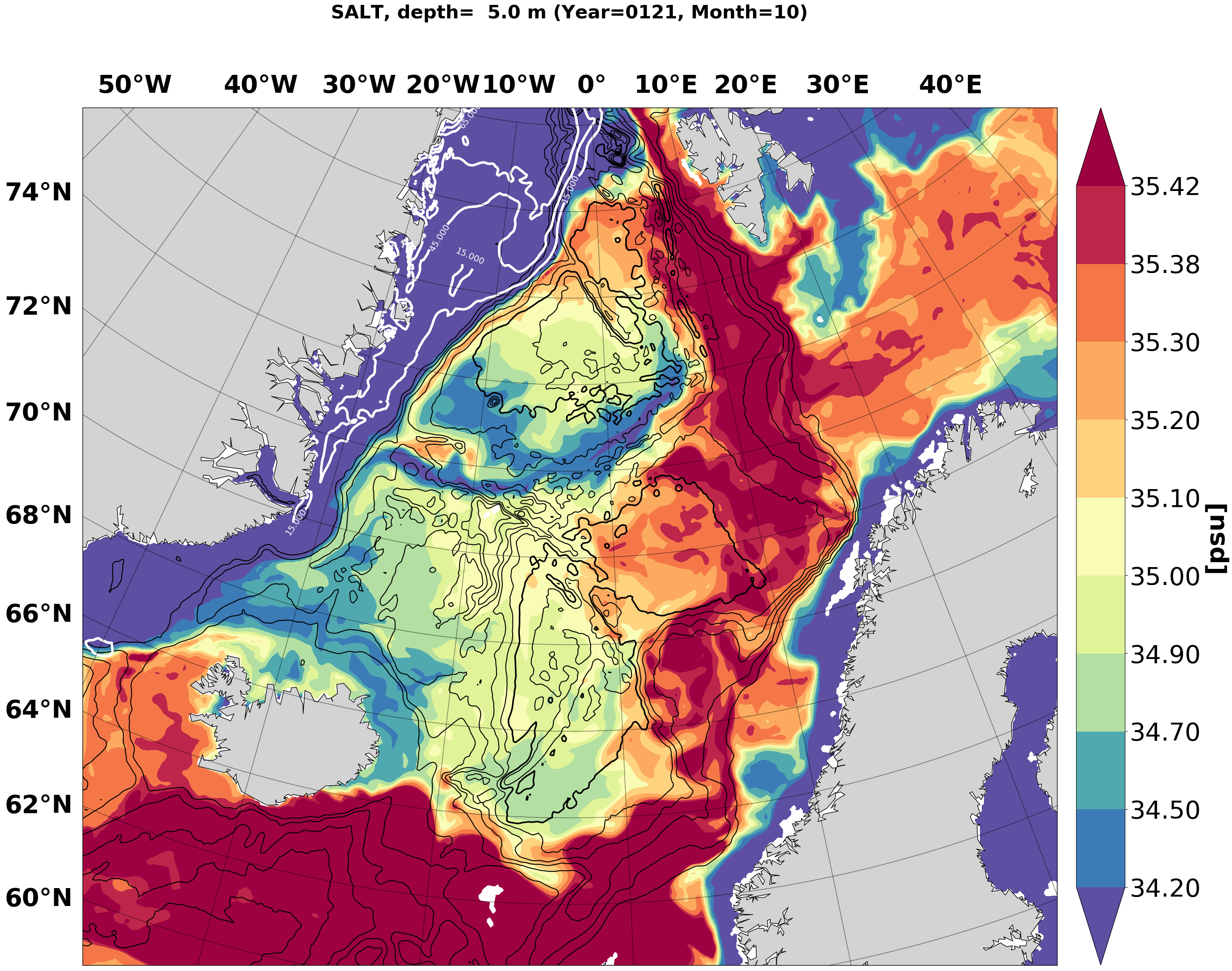
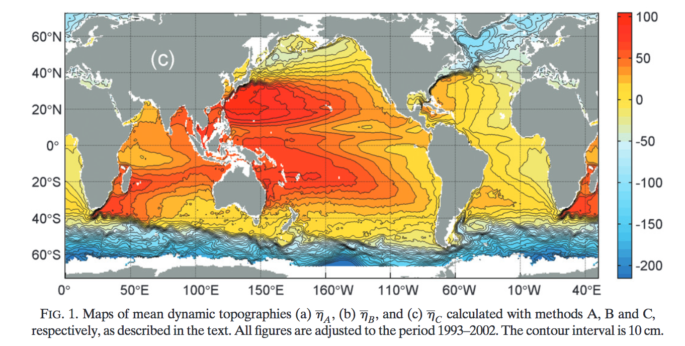
I was looking at the Centurioni paper about their Mean Dynamic Height product (which at some point we discussed we would use for this, but we never downloaded it), and I thought this was a nice picture:
perhaps at some point we could add the 10cm contours to ours? |
|
yes, the new ones look nice. |
|
Wow, @milenaveneziani, I agree that's quite a nice looking figure. That's probably a custom color map that we could easily duplicate (I added a couple of custom color maps as well in the plotting module). Given that adding contours would be a non-trivial modification to plotting, I think we should leave that for a follow-up PR. Perhaps after the paper, given the very tight timeline. |
There was a problem hiding this comment.
These look great. I like the color bar.
One question: SSH is almost always reported in cm, so this would range from -250 to 150. Our native unit is meters, of course, but I think it's better to use units in plots that are standard. What do you all think? Also asking @maltrud.
|
@mark-petersen, I'm fine with switching to cm if that's standard. The standard is dumb in this case but it's not my place to try to force a new standard... :-p |
|
Here is a plot with units of cm instead of m: |
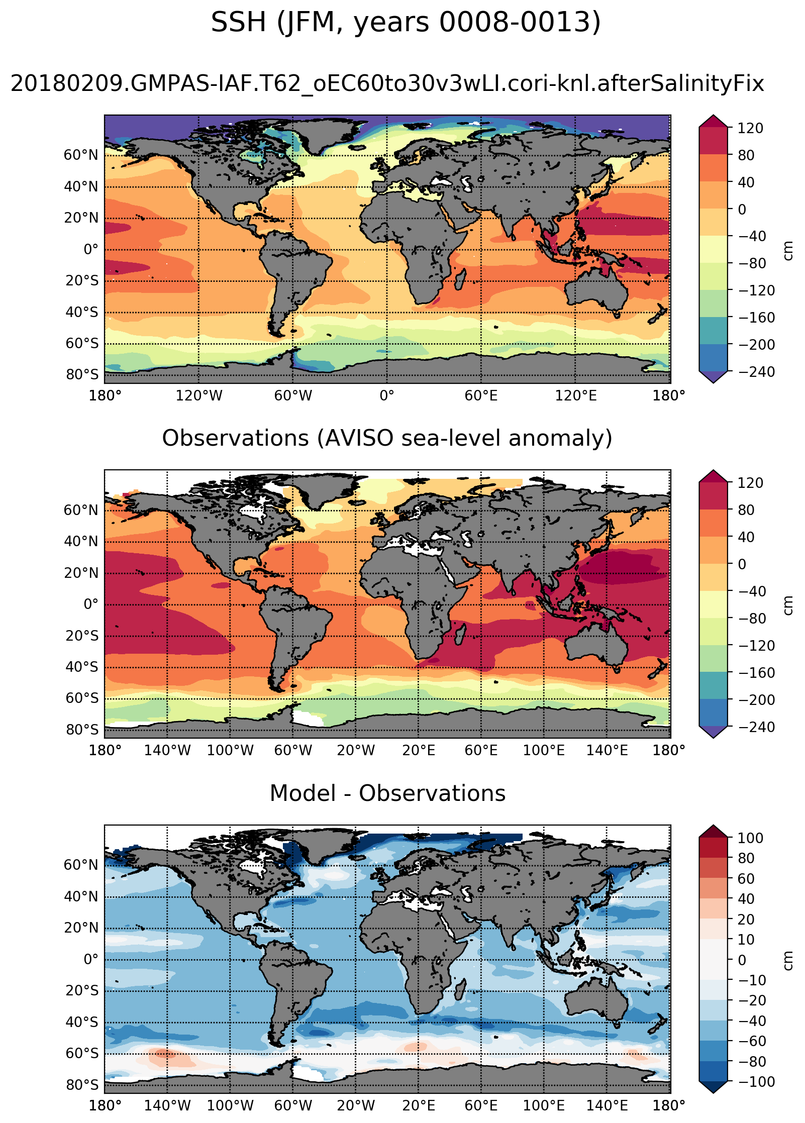
A task for plotting the SSH vs. observations from AVISO.